Become a MacRumors Supporter for $50/year with no ads, ability to filter front page stories, and private forums.

DoNoHarm

macrumors 65816
Original poster
Oct 8, 2008
1,138
46
Maine
Just upgraded to the iPhone 14 pro and I’m pretty shocked to see the case has this ugly indented spot where the SIM card used to be. I can’t believe this passed the desk of whoever is in charge of apples design these days and I guarantee you that this would have been stopped by Ive or Jobs if they were still at Apple. And the slippery/fingerprint magnet stainless steel sides and slippery matte back case are just poor design decisions as well.

/vent
 
Just upgraded to the iPhone 14 pro and I’m pretty shocked to see the case has this ugly indented spot where the SIM card used to be.

/vent
If you’re talking about the black area on the right side of the phone below the side button, that’s for the 5G antenna.

SIM slot used to be on the left side, which is now completely smooth. No indentation at all.
 
Just upgraded to the iPhone 14 pro and I’m pretty shocked to see the case has this ugly indented spot where the SIM card used to be. I can’t believe this passed the desk of whoever is in charge of apples design these days and I guarantee you that this would have been stopped by Ive or Jobs if they were still at Apple. And the slippery/fingerprint magnet stainless steel sides and slippery matte back case are just poor design decisions as well.

/vent
"You're holding it wrong!" (Steve Jobs)
 
Jony Ive gave us iOS 7 and all it's preschool primary colors that were inspired by PlaySkool, Fisher-Price and Tutor Time.

Apple took multiple years to allow a dark mode on Mac and iOS. Apple withdrew widgets on the screen with iOS 7 (introduced in iOS 6), then took years to give them back.

You may miss that era. I do not.
 
Last edited:
Just upgraded to the iPhone 14 pro and I’m pretty shocked to see the case has this ugly indented spot where the SIM card used to be. I can’t believe this passed the desk of whoever is in charge of apples design these days and I guarantee you that this would have been stopped by Ive or Jobs if they were still at Apple. And the slippery/fingerprint magnet stainless steel sides and slippery matte back case are just poor design decisions as well.

/vent
That is not the Sim card slot, that’s the 5G antenna.
As you know, your buddies Steve and Ive found out a thing or two about antennas and where they need to be placed…
 
Jony Ive gave us iOS 7 and all it's preschool primary colors that were inspired by PlaySkool and Tutor Time.

Apple took multiple years to allow a dark mode on Mac and iOS. Apple withdrew widgets on the screen with iOS 7 (introduced in iOS 6), then took years to give them back.

You may miss that era. I do not.
I don’t recall widgets in IOS 6, what were they?
 
Yep, starting from the notch, glossy edges, 3-camera island, huge square form factor — the design is horrible. Maybe Jony Ive left because he didn't want to sign that crap, who knows. I don't remember whether he left before or after the notch.

Most Androids are no better, but some still look nice and fresh, like Google Pixel.
 
I don’t recall widgets in IOS 6, what were they?
You were allowed to put them in the NC (Notification Center).

Here's the Weather Widget (Settings App and then the NC). Note the weather is not correct. This is from my 3GS. I booted it up so you could see - but it's iOS 6 so the weather is not working.

Screen Shot 2023-02-12 at 13.35.27.jpgScreen Shot 2023-02-12 at 13.35.10.jpgScreen Shot 2023-02-12 at 13.34.43.jpg

I jailbroke my iPhone 5 in February 2013. It was on iOS 6.0.1 for a few years. Dashboard X allowed you to move your widgets to the homescreen and a file browser let you remove the background.. I've got over 6,000 photos in my camera roll though, so I can't seem to find a screenshot of the weather widget on my homeecreen.

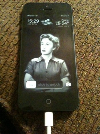
Below though, is Forecast which allowed you to have the weather and time on your lockscreen (while displaying the active weather animation from the weather app). I'm showing you this simply because it's equivalent to the weather widget.

2013-02-09 15.29.05.JPG2013-09-29 15.35.25.JPG
 
People are saying that's the 5G antenna which is fair. But that's beside the point since the OP is saying that it's ugly and poor design. Pointing out that it's for 5G does not address the issue.
I had to look on my iPhone to see what people were talking about. I’ve never noticed it.
It’s struggles like this that we go through in life that build character.
 
You didn't need to jailbreak. iOS 6 stock let you put widgets in the NC. Jailbreaking just allowed you to move them to the homescreen.
True Erik, but everyone upgraded their iPhone 4, 4s and 5 to newer versions of iOS. To restored them to iOS 6 you need a downgrade tool, usually requiring jailbreak. iPhone 4 on iOS 7 runs terribly, and looks terrible.
 
  • Like
Reactions: eyoungren
True Erik, but everyone upgraded their iPhone 4, 4s and 5 to newer versions of iOS. To restored them to iOS 6 you need a downgrade tool, usually requiring jailbreak. iPhone 4 on iOS 7 runs terribly, and looks terrible.
I have iOS 7 on my iPhone 4 and iOS 9 on my 4s. :(

Don't use those two phones a lot…
 
I don’t recall widgets in IOS 6, what were they?
There we go…

I had to go dig around in MacRumors jailbreak section to find this. Note, that by this point I had Forecast installed so it modified the Weather Widget to also display the time.

But it was Dashboard X that allowed the Weather widget to be on the homescreen.

Also…I was running a dark/grayscale theme and the splashes of color you see were a tweak called Bars. It was animated, allowing colored streaks to stream across your screen in random directions. Made by a couple of high schoolers that never did any JB tweaks afterwards.

iPhone 5, iOS 6.1.

2013-03-09 20.37.11.png
 
To be fair the camera design on the pro models is so ugly it’s unforgivable. Started bad with the 11 pro and has got more ludicrous with each release since

The standard iPhones are much nicer aesthetically
Agree fully. Honestly surprised more people don't talk about this. I thought I would eventually get used to it, but I chose space gray to hide the ugliness of the camera array on my iPhone 13 Pro. The cameras on the X/XS looked so nice and discreet.
 
Register on MacRumors! This sidebar will go away, and you'll see fewer ads.