Become a MacRumors Supporter for $50/year with no ads, ability to filter front page stories, and private forums.

IChing

macrumors regular
Original poster
Sep 25, 2007
140
0
Just a few complaints but maybe it should be looked at.


1. the size of the fonts are not the same
in headlining subjects

2. Putting the poster's info causes you to sometime click on that vs the title of the thread.

3. Get rid of go to page.... whatever and give an arrow to next page.

4. I love the site but you really make it more friendly to iphone and ipod touch users
 
Have you tried the iPhone Friendly Version by switching the box at the bottom left of the site?
 
Have you tried the iPhone Friendly Version by switching the box at the bottom left of the site?
Im not going to lie, all that does is narrow the threads down to the size of the iPhone. I would love to see Arn put as much effort into macrumors as he does with appshopper. Just saying :eek:
 
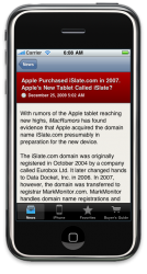
There is an iPhone application under development.

The design still needs some tweaks (although it's pretty hard to make the MR colours of dark red, light blue and beige look good together), and there are still quite a few features to implement and bugs to fix, but it's coming together nicely, if I do say so myself.

EDIT: I should add that forum access isn't expected (at least for v1). It might be possible to work something out, but we'll have to see. It's a start though.
 

Attachments

  • Screen shot 2009-12-27 at 06.08.32.png
    Screen shot 2009-12-27 at 06.08.32.png
    225.2 KB · Views: 84
There is an iPhone application under development.

The design still needs some tweaks (although it's pretty hard to make the MR colours of dark red, light blue and beige look good together), and there are still quite a few features to implement and bugs to fix, but it's coming together nicely, if I do say so myself.

It looks awesome. Good work man! I remember reading about this months ago. It has come along nicely.
 
Have you tried the iPhone Friendly Version by switching the box at the bottom left of the site?

Well... when using the mobile version as i do... and i click on the links [xx comments] it forces you to a login prompt for the forums, which I dont want as I only comment when using a computer and not a mobile device... would be nice to have a view comments option as opposed to a login.
 
I HATE the iPhone version of MR.

- Why can't I jump to the last comment of a thread if I've been following along with the conversation and don't need to read Post #1?

- When I want to quote someone in my reply, why can't I see the quote until after I post it? Sometimes I only want to quote a small part of a very long post.

- As IChing suggested, have a "Next Page" arrow, or a list of pages like we have in the regular version of this website for us to click on. Ditch the "Go To" page.


I just use the regular forums. I'd rather zoom in and have the 2 or 3 regular features that I always use rather than lose those features, but have faster loading pages.

MR Mobile isn't the worst mobile website I've encountered, but when you consider the fact that this website is about Apple, you'd think MacRumours would put more effort into making the iPhone browsing experience really good.
 
Register on MacRumors! This sidebar will go away, and you'll see fewer ads.