Got a tip for us?
Let us know
Become a MacRumors Supporter for $50/year with no ads, ability to filter front page stories, and private forums.
I Want A Serious Response (old vs new icons)
- Thread starter berniemakaveli
- Start date
- Sort by reaction score
You are using an out of date browser. It may not display this or other websites correctly.
You should upgrade or use an alternative browser.
You should upgrade or use an alternative browser.
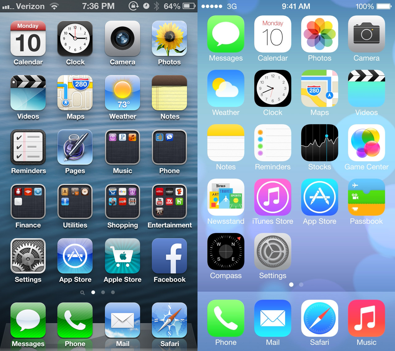
ioS 7 looks fine with some more work needed on the icons. I think the color scheme they are trying to use are a bit too girly and feminine for my tastes. The icons themselves have no consistency. Why are some of the icons encircled and others not? Why are some solid black while the others are neon-feminine? Why do some graphics of the icons appear larger than the others.
I look at the Google icons for their apps and see tremendous consistency, which Apple lacks.
I do like the Calender and Photos icons. Don't understand why the Music icon is pink. Safari icon looks like it doesn't belong or they got the colors backward. Some icons are still "skeu'd" (Videos, Compass, Clock) and just look plain and bare (Notes, Reminders). Consistency is key.
I cringe, because iOS 6 looks so bad next to iOS 7
Mine cringes but I think each have some positives and some negatives. I felt that iOS 6 had gotten a bit "stale" but I don't believe this move was necessarily the correct fix for that.
Thats how I feel.
iOS7 looks like a funfetti explosion I'll never be able to clean up.
I don't want to go back to iOS 6, I am happy with iOS 7 and what they have done across the entire OS.
Pros and Cons to both, obviously. And I was skeptical at first, but you have an unfair comparison going on. Your iOS 6 screenshot has non default applications there in folders, etc. The iOS 7 screenshot you used is default, with no changes. I think once you get your hands on iOS 7 and can play around with it you'll change your opinion. That happened to me.
That said I still think the preferences and Safari icons are ugly, but hopefully they'll change at least a little bit.
I actually like the new design, but I understand that it is polarizing.
iOS6 feels bloated and heavy compared to the new look in my opinion. I do find it weird that most new icons are flat, yet Game Center has these 3D blobs.
Pros and Cons to both, obviously. And I was skeptical at first, but you have an unfair comparison going on. Your iOS 6 screenshot has non default applications there in folders, etc. The iOS 7 screenshot you used is default, with no changes. I think once you get your hands on iOS 7 and can play around with it you'll change your opinion. That happened to me.
That said I still think the preferences and Safari icons are ugly, but hopefully they'll change at least a little bit.
The only thing that will make me happy with iOS7 is the jailbreak. Themes FTW!
I cringe, because iOS 6 looks so bad next to iOS 7
I don't want to go back to iOS 6, I am happy with iOS 7 and what they have done across the entire OS.
These. The new color scheme takes a little bit of getting used to, but once you grow acquainted with it, you'll love it.
The old OS is so boring and needed to be axed.
It was getting stale, but handing a kindergardener some crayons and telling him to design some icons is any better?
The more I look at iOS 7 the more I like it. The colors are a bit bright, and the icons need a little work, but overall the features added with iOS 7, along with some of the cool zoom animations, along with how things shift depending on how you hold the phone, give it a fresh feel to me. I'm sure by the time we have Beta 18 or whatever they go up too, they'll iron out some details, AND I'll be more used to the look.
I get what you're saying. That said, I was so exceedingly bored with the old style that I really don't care that the new interface is straight out of the Fisher Price labs... for now.
")
Its so loud, especially with that wallpaper you have on - my eyes are bleeding! Please fix it IVE!
Wallpaper I have on? Thats the stock wallpaper lol *cough cough* Android *cough*
really? u really think ios6 looks better than 7? ...wow...
whatever i give up.
The static images in iOS 7 do not seem to pop-out as much on the background (which is something designers should aim for because it allows rapid selection). However, from the WWDC intro yesterday they mentioned something about the icons moving slightly as the phone is tilted. If Apple has done this right, then they will create the illusion of motion parallax, and the icons will appear to float above the background. Thus, we cannot judge the GUI from static pictures. Just sayin'.
Last edited:
I get what you're saying. That said, I was so exceedingly bored with the old style that I really don't care that the new interface is straight out of the Fisher Price labs... for now.
See I was getting a little bored too, but change for the sake of change (and especially change towards a bubblegum funfetti explosion) isn't what one should do, nor is it what Apple presents themselves to be. Jobs' absence is definitely being felt.
whatever i give up.
Cool, didnt care you tried in the first place.
Register on MacRumors! This sidebar will go away, and you'll see fewer ads.