Become a MacRumors Supporter for $50/year with no ads, ability to filter front page stories, and private forums.

LIVEFRMNYC

macrumors G3
Original poster
Oct 27, 2009
8,927
11,083
These Widget backgrounds definitely clash with the wallpaper, and it's and eyesore. Would love it so much better if, Apple added transparency to the background. And it doesn't help that the weather widget changes color according to day and night.


See how it looks on Android to the far right. Apple Widgets would look so much better with a background transparency option.
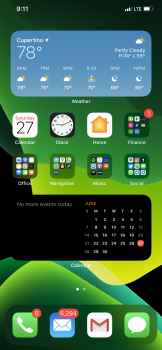
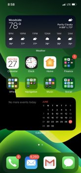
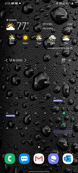
IMG_0535.PNG IMG_0534.jpg Screenshot_20200627-205838_One UI Home.jpg


Also, I wish Apple would remove the text from under widgets. I know a weather or calendar widget when I see it, no need for labels.
 
  • Like
Reactions: Marlon DLTH :)
Agree. The “App Suggestions” widget have transparency on the background, so probably we will see third party widgets like this one. I hope.
 
I cannot see this happen. They don’t allow transparency in app icons and these widgets need to look uniform on the home screen. The current design is literally that the widget looks like a huge app icon with information in it. That’s why I don’t think they will do it.

About the text underneath the widget, same story. Also, when you have third party widgets I can imagine Apple would not allow them to be without label as it always needs to be clear for the user what app is showing that data.
 
Definitely make feedback suggestion. It’ll take them some time to start allowing that stuff. Probably 3 years lol.
 
There were transparent tiles on windows phone and they looked terrible
it won’t look as good as you think it will
 
  • Like
Reactions: BMox81
I think they should use the same light/dark translucent background that takes on the shade of the underlying wallpaper as exists in the widgets for iOS 13.

I agree, it looks too disjointed like that.
 
Sorry, but that looks like crap on Android. I literally have to "search" for the info I'm looking for, while on iOS, all it takes is a quick glance.

(and that's a relatively uniform wallpaper on the Android phone)
 
  • Like
Reactions: dcp10 and johaen8
I’m glad they’ve finally moved away from having everything look like frosted glass
 
Sorry, but that looks like crap on Android. I literally have to "search" for the info I'm looking for, while on iOS, all it takes is a quick glance.

(and that's a relatively uniform wallpaper on the Android phone)

To each their own. But I don't need widgets to smack me in the face with bright multi colors and bold text. For many like myself, subtle is better.


There were transparent tiles on windows phone and they looked terrible
it won’t look as good as you think it will

Some transparent tiles on WP looked good, some looks bad. That's the same with Android. But Apple should allow the option.
 
Register on MacRumors! This sidebar will go away, and you'll see fewer ads.