Got a tip for us?
Let us know
Become a MacRumors Supporter for $50/year with no ads, ability to filter front page stories, and private forums.
I was bored and I had Photoshop and Macrumors open.
- Thread starter daveylp
- Start date
- Sort by reaction score
You are using an out of date browser. It may not display this or other websites correctly.
You should upgrade or use an alternative browser.
You should upgrade or use an alternative browser.
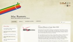
I like the look (it's a lot better than what we have now!) but there is a heck of a lot of dead space in the header. That would need to be fixed.
Wirelessly posted (Mozilla/5.0 (iPod; U; CPU iPhone OS 4_1 like Mac OS X; en-us) AppleWebKit/532.9 (KHTML, like Gecko) Version/4.0.5 Mobile/8B118 Safari/6531.22.7)
I always thought macrumors needed a change in looks")
I always thought macrumors needed a change in looks
They changed to that stupid looking Apple logo about 6 or 7 years ago (IIRC).. probably to minimize the chance of getting sued by Apple lol.
(and by this, I'm referring to the current logo that looks like a really strange post it note thumb-tacked at the bottom)
(and by this, I'm referring to the current logo that looks like a really strange post it note thumb-tacked at the bottom)
They changed to that stupid looking Apple logo about 6 or 7 years ago (IIRC).. probably to minimize the chance of getting sued by Apple lol.
(and by this, I'm referring to the current logo that looks like a really strange post it note thumb-tacked at the bottom)
I like the logo. The question mark is quite relevant considering this is a rumours site.
I like the look (it's a lot better than what we have now!) but there is a heck of a lot of dead space in the header. That would need to be fixed.
You need not worry, arn would fill that space up with something.
They changed to that stupid looking Apple logo about 6 or 7 years ago (IIRC).. probably to minimize the chance of getting sued by Apple lol.
(and by this, I'm referring to the current logo that looks like a really strange post it note thumb-tacked at the bottom)
Believe it or not, but I had been coming here nearly a year before I even saw the '?' in the logo.
Of all the mockups of new looks for MR, this is far and away the most unique. Kudos to you for that!
Looks like a blog instead of an actual website.
That's mostly what MacRumors is; It's an Apple blog.
I like the nostalgic look.. Too much whitespace in the header, but otherwise cool.
Believe it or not, but I had been coming here nearly a year before I even saw the '?' in the logo.
Didn't notice this until you pointed it out.
Got to pay for the site somehow. Good point!You need not worry, arn would fill that space up with something.
Didn't notice this until you pointed it out.
That was the first thing I noticed. It's always ticked me off that the apple doesn't quite look like an apple. Ah well.
Register on MacRumors! This sidebar will go away, and you'll see fewer ads.