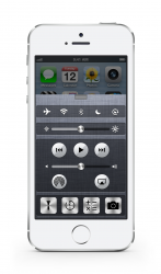
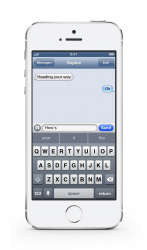
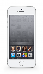
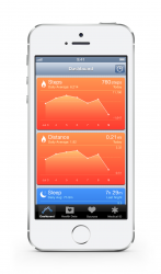
Become a MacRumors Supporter for $50/year with no ads, ability to filter front page stories, and private forums.

LordQ

Suspended
Original poster
Sep 22, 2012
3,582
5,653
Hey guys!

So I made these to contrast how –in my humble and personal opinion– iOS 6 design looks compared to the simple, elegant and beautiful iOS 8/7 design language.

Yeah, I know what you're thinking "oh, we're still on that?" but I know a lot of people who still complain about it so as I said, I wanted to contrast both design languages and create a nice discussion.

Anyway, here you have some iOS 8 features with the old look... Enjoy!

Happy Throwback Thursday! :)

http://bit.ly/1xoJrA2
 

Attachments

  • 1.png
    1.png
    1.1 MB · Views: 360
  • 2.png
    2.png
    1.3 MB · Views: 273
  • 3.png
    3.png
    354.4 KB · Views: 259
  • 4.png
    4.png
    1.3 MB · Views: 263
  • 6.png
    6.png
    378.8 KB · Views: 252
Last edited:
My opinion and in no way does it invalidate any one else's


I still prefer iOS 7-iOS 8 design. I like flat, but I wish they didn't make some things too neon like the message bubbles.

iOS6 looking at the images above, it's metallic looking but it feels outdated to me. iOS7's design overhaul was the reason I stuck with apple. I was close to going android. But that's just me. :D
 
Lol I actually like your designs better than the current iOS 8. Not that the iOS 8 design is bad, I just like that one better.
 
That actually looks pretty good! I don't think I would mind that look, but I'm alright with its current look too. Good job.
 
Beauty is always in the eye of the beholder. If you like iOS 7/8 well awesome. I still prefer pre iOS 7. I've gotten used to iOS 7 but since I still have an iPad running iOS 5 so I don't have to reminisce.

I prefer the look Scott Forstall and Steve Jobs went after. It doesn't look any dated than iOS 7 or 8. At least anything before iOS 7 doesn't remind me of Android.

I have an original iPad running 5.1.1 and I quite like it. I just think 8/7 look even better... And I just hate linen :(
 
Hah, awesome and eye opening! I always hated the Notification Center linen that pulled down with the shade, instead of how it should have worked with the UI pulling down out of the way to reveal the linen and NC.
 
There's no right or wrong or good or bad when it comes to aesthetics. There's nothing to defend or something that could even be defended. Everyone can like whatever they like. Such a silly thing to try to "prove" when there's nothing that can be proven.

Thanks for the designs though, it's fun to see that kind of stuff, and apparently as many others in this thread so far, I like the look in many ways.
 
When using a device with iOS 5 or 6 on it now it feels antiquated, just like Mavericks does since I switched to the Yosemite PB almost full-time.

But that's only my opinion, others are of course allowed to feel differently.
 
Notification center looks fine.

Control Center looks kind of cluttered and messy in this style.

But omg, the Health App and Messages, looks so clunky and old, like looking back on Windows 3.1.
 
I would like to see that in a theme on cydia!
Turn your concept into reality :D

Though room for criticism, I think those contact pictures would have some rounded corners to resemble the other icons as well.
 
I've been using the iPhone since the original one in 2007, and I have to admit that I'm not a fan of the iOS 7/8 look, especially the ultra skinny Helvetica Neue. Fonts used to be one of iOS's strong suites. I do some Android development for work and to my eyes Kitkat is a nice compromise with some textures and yet with a modern look. Plus the Roboto font is so much more readable. I'm not sure about the material design in Lollipop though. Its a pity we don't have the ability to switch Springboard out for alternative launchers. I got a chance to play with Xiaomi's MIUI themes and they are fantastic.
 
Register on MacRumors! This sidebar will go away, and you'll see fewer ads.