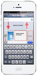
Heres a rough image of what i think sending a message from an app other than Messages should look like in iOS.
It would work like photo stream does at the moment where once you click message you then select your recipients and this card will then show to type your message.
Many of you didn't like the green, but i think for messages the header has to be green for the user to identify what they are doing, agreed the shade could be nicer.
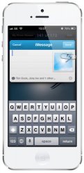
As pointed out the iMessage card should be blue (hopefully you like this colour)")
Edits:
 changed from iMessage to Messages and clarified that this is a concept for sending a message from an app other than Messages e.g. Photos
Added recipients at bottom
Added plus icon to add/remove recipients
Changed colour of iMessage card
Updated Messages card
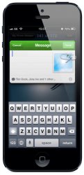
It would work like photo stream does at the moment where once you click message you then select your recipients and this card will then show to type your message.
Many of you didn't like the green, but i think for messages the header has to be green for the user to identify what they are doing, agreed the shade could be nicer.
As pointed out the iMessage card should be blue (hopefully you like this colour)
Edits:
changed from iMessage to Messages and clarified that this is a concept for sending a message from an app other than Messages e.g. PhotosAdded recipients at bottomAdded plus icon to add/remove recipientsChanged colour of iMessage cardUpdated Messages cardAttachments
Last edited: