
Apple today, with iOS 15, announced a slew of new changes coming to notifications on iPhone, including a completely redesigned interface and a new way to summarize notifications based on activities.
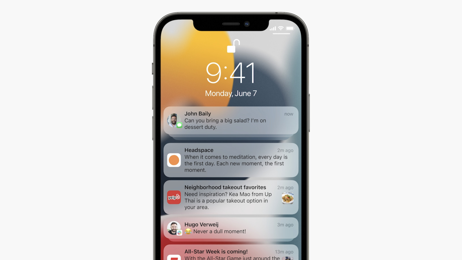
Notifications now have a completely new design on the lock screen, featuring richer images for messages, and a cleaner more compact look. With the redesign, iOS 15 also introduces a Notification summary, which uses on-device machine learning to automatically populate notifications based on priority in a new lock screen design.
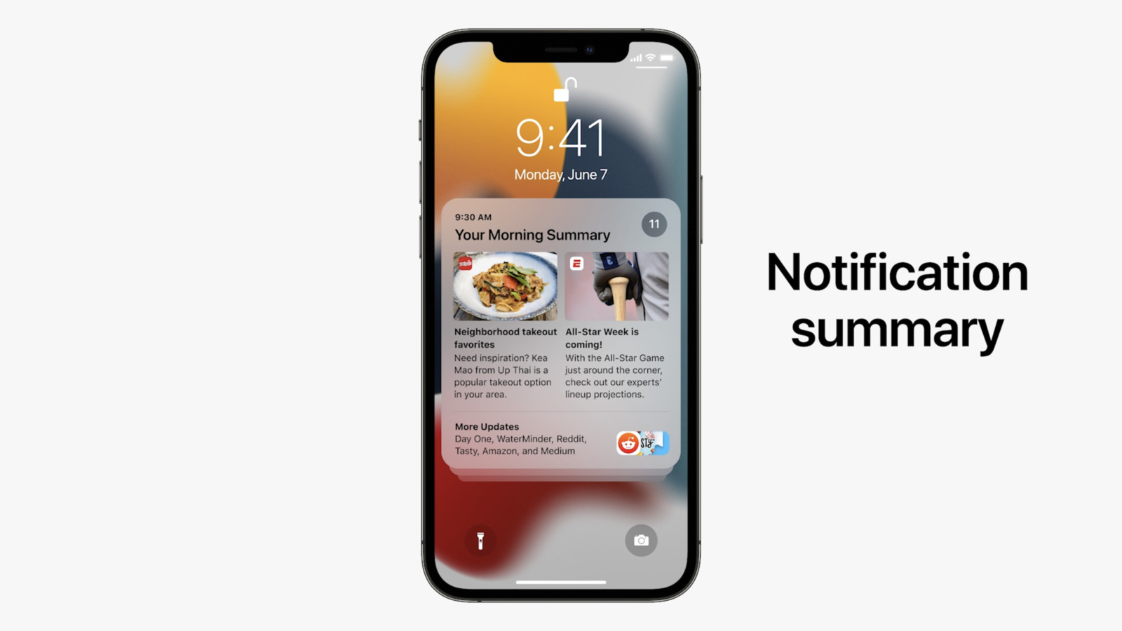
The redesigned notifications is one of many changes coming to iOS 15. Learn more about all the other new features.Notifications have been redesigned, adding contact photos for people and larger icons for apps that make them even easier to identify. To help reduce distraction, a new notification summary collects non-time-critical notifications for delivery at a more opportune time, such as in the morning and evening. Using on-device intelligence, notifications are arranged by priority, with the most relevant notifications rising to the top, and based on a user’s interactions with apps. Urgent messages will be delivered immediately, so important communications will not end up in the summary, and it’s easy to temporarily mute any app or messaging thread for the next hour or for the day
Article Link: iOS 15 Features Redesigned Notifications and New Notification Summary Sorted by Priority
Last edited:
