Become a MacRumors Supporter for $50/year with no ads, ability to filter front page stories, and private forums.

MacRumors

macrumors bot
Original poster
Apr 12, 2001
68,530
39,364


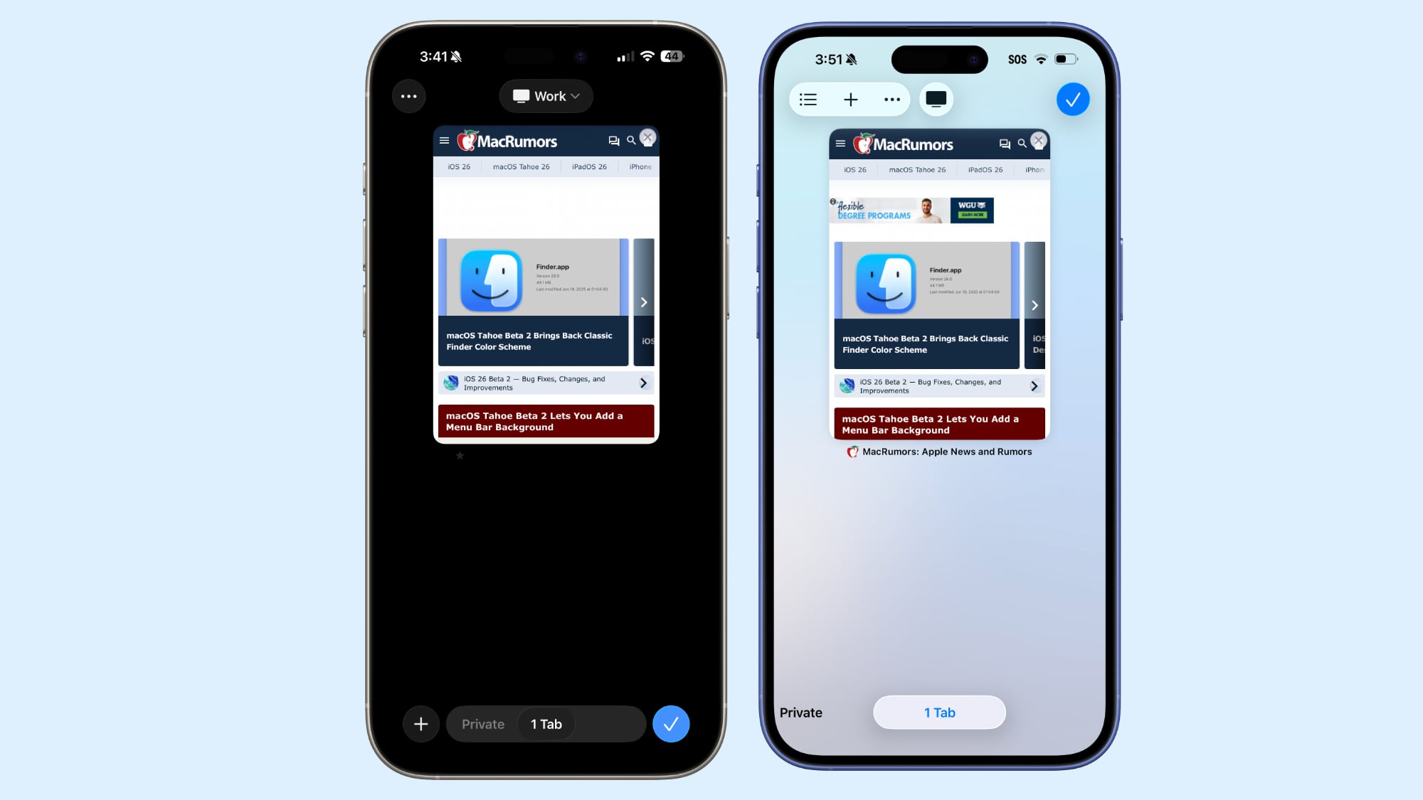
In iOS 26 beta 2, Apple updated the location of the new tab icon in Safari, fixing a frustrating change that was made in the first iOS 26 beta.
safari-design-changes-ios-26-b2.jpg
Safari in beta 2 on left, Safari in beta 1 on right

The initial iOS 26 release introduced three view options for the tab bar and it changed the look of the interface for managing all open tabs. The tab view significantly altered the placement of buttons, including the "+" button for a new tab.

Apple moved the button from the bottom of the Safari interface in iOS 18 to the top in iOS 26, which led to people tapping the wrong buttons when trying to open a new tab. There was no logical reason for the "+" button to move to the top of the screen, and in iOS 26 beta 2, Apple moved it back to the bottom of the app.

The Safari tab management interface in iOS 26 beta 2 is now similar to the tab management interface in iOS 18. The new tab option is on the left where it always was, and while "Done" is now a checkmark, it's still there on the right.

Apple kept the option to swipe between standard browsing, private browsing, and tab browsing, rather than tucking those away behind a hamburger menu. Options for managing tab groups, selecting tabs, and copying links remain in the top left.

iOS 26 beta 2 makes another small change to Safari, for those who opt to use the new "Compact" Safari tab view. With the Compact setting, if you tap on the back button, the button now splits into a forward and a back button for easier navigation. Before, there was no forward button option.

The top and bottom layouts have not changed, and have always had both the forward and back buttons.

Article Link: iOS 26 Beta 2 Fixes Frustrating Safari Design


In iOS 26 beta 2, Apple updated the location of the new tab icon in Safari, fixing a frustrating change that was made in the first iOS 26 beta.


safari-design-changes-ios-26-b2.jpg


Safari in beta 2 on left, Safari in beta 1 on right

The initial iOS 26 release introduced three view options for the tab bar and it changed the look of the interface for managing all open tabs. The tab view significantly altered the placement of buttons, including the "+" button for a new tab.

Apple moved the button from the bottom of the Safari interface in iOS 18 to the top in iOS 26, which led to people tapping the wrong buttons when trying to open a new tab. There was no logical reason for the "+" button to move to the top of the screen, and in iOS 26 beta 2, Apple moved it back to the bottom of the app.

The Safari tab management interface in iOS 26 beta 2 is now similar to the tab management interface in iOS 18. The new tab option is on the left where it always was, and while "Done" is now a checkmark, it's still there on the right.

Apple kept the option to swipe between standard browsing, private browsing, and tab browsing, rather than tucking those away behind a hamburger menu. Options for managing tab groups, selecting tabs, and copying links remain in the top left.

iOS 26 beta 2 makes another small change to Safari, for those who opt to use the new "Compact" Safari tab view. With the Compact setting, if you tap on the back button, the button now splits into a forward and a back button for easier navigation. Before, there was no forward button option.

The top and bottom layouts have not changed, and have always had both the forward and back buttons.

Article Link: iOS 26 Beta 2 Fixes Frustrating Safari Design
I use a Screen Time passcode to prevent changes to my account in case my phone gets stolen. It is really annoying that iOS26 Private Browsing is not available in Safari if a Screen Time passcode is enabled. This was not an issue in iOS18.
 
Easiest (new) way is to swipe left on the address bar to open a new tab. No +-button needed!

You can also open the tab switcher by dragging up in the address bar, but it’s a pretty delicate dance to not open the app switcher instead.
 
Was about to post an ignorant reply about “I want a button to close all tabs”, but I searched it and found it existed! (press and hold the tab icon) I’ll adjust my comment to “I want a button to close all applications”
 
Is my vision really so poor that I'm the only one who's biggest 'pain point' is actually simply finding the active tab when the web page presented in the tab has a black background (i.e. the majority if you run in "Dark" mode)? I have to set the screen to maximum brightness to just barely make it out! Attaching screenshot.

I was hoping this beta made things better. It did a little bit - by adding some sort of thick line(??) under the non-active tabs - but those are also nearly impossible to make out in the above case.
 

Attachments

  • Screenshot 2025-06-23 at 4.38.07 PM.png
    Screenshot 2025-06-23 at 4.38.07 PM.png
    98.6 KB · Views: 31
Will ios26 fix iCloud tabs mine have been broken since ios18 showing me old data from days ago. Plus my safari on iPhone has a micro shutter for about 5 seconds when I open my iPhone 15 pro but not all the time 🤷🏻‍♂️.
 
Why is the plus icon on the left.. where as the checkmark icon on the right…
The checkmark icon returns to the safari pages, and logically make sense to be on the left. The plus icon opens a page on the right.
 
Easiest (new) way is to swipe left on the address bar to open a new tab. No +-button needed!
This is how it worked in the previous iOS as well, you swipe on the url field in one direct to get a new tab, or other to go back. The problem is, in the past gen and now still, that only works for creating a new tab if you are currently viewing the latest tab. If you are viewing an older tab and swipe left (to go right), it will just go to the next tab rather than creating a tab. While that makes sense, it makes the "+" button more of the go to since you know it will always result in a new tab. So when they threw it in the top left made absolutely no sense since so many changes this year appear finally targeted at once handed use.
 
I am still not able to enable a private browsing window if I have a screen time passcode enabled even though I don’t have safari restricted in any way. Anyone else? The option simply disappeared, the moment I use a screen time passcode
This and they need to decouple Apple Music explicit setting from screen time too.
 
Register on MacRumors! This sidebar will go away, and you'll see fewer ads.