Become a MacRumors Supporter for $50/year with no ads, ability to filter front page stories, and private forums.

Kevsta26

macrumors 6502a
Original poster
Apr 2, 2011
678
301
USA
If I try to apply a nice fall wallpaper like this -
Autumn-Road-iphone-5-wallpaper-ilikewallpaper_com.jpg


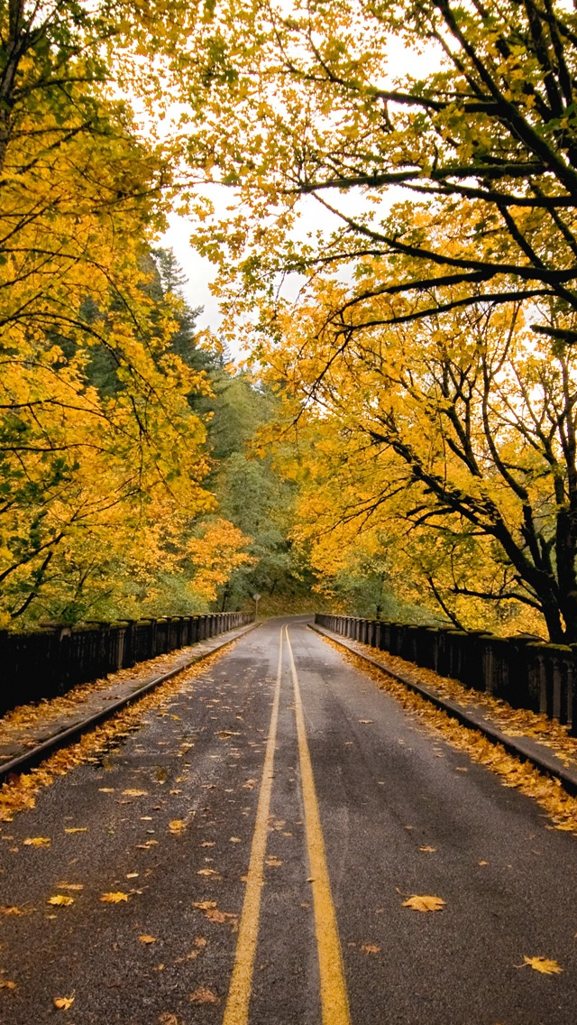
iOS 7 put this stupid dark line across the top, ruining the look of the wallpaper...
6rsg37.jpg


It may have to do with the clock but I don't care, I would rather have a nice looking wallpaper than a dumb dark line that helps improve the visibility of the clock and status bar...
 
Just reviving this old thread to see if anyone knows of a fix for this. I'm trying to use my wallpaper on my home screen and it does the same thing with the dark band up top. On the home screen my icons will show up just fine without the darkening, so I'm not worried about that.
 
Just reviving this old thread to see if anyone knows of a fix for this. I'm trying to use my wallpaper on my home screen and it does the same thing with the dark band up top. On the home screen my icons will show up just fine without the darkening, so I'm not worried about that.

You can't change it as of now.
 
The reason why its there is because of your background. If it wasn't there, you would not be able to read the time since the background just behind the time is a mix of white (sky) and colour (leaves and branch). Depending on the background, the time text colour is either black or white. Since the area right behind the text has shades of both white and a contrasting colour, it is in your best interest that iOS puts a tinted gradient on the top for better readability.
 
Am I the only one who likes this? It helps with the readability. I noticed this with wallpapers that seem to blend with the text on lock screen and I find this a useful feature.
 
Register on MacRumors! This sidebar will go away, and you'll see fewer ads.