Got a tip for us?
Let us know
Become a MacRumors Supporter for $50/year with no ads, ability to filter front page stories, and private forums.
iOS 7 Dock
- Thread starter Designed4Mac
- Start date
- Sort by reaction score
You are using an out of date browser. It may not display this or other websites correctly.
You should upgrade or use an alternative browser.
You should upgrade or use an alternative browser.
There's also old style unlock in the thumbnail preview of the screen in the brightness and wallpaper settings section.
Where is the unlock. I cant see it any where

On the iOS device itself if you go to Settings > Brightness & Wallpaper and look at the preview screenshots in the Choose Wallpaper section--the old unlock screen is there.Where is the unlock. I cant see it any where
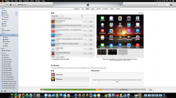
iTunes needs an update... Probably will get it in same day that iOS 7 released to public.
This. iTunes hasn't been updated yet.
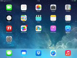
New dock is so bad.
What's annoying is at the top you can see a tiny bit where it's more transparent, but then it's the full thing.
If there was a larger/more gradual transparent area, it'd look much better.
Yeah I hate that too. I think it will look good once it's transparent (as I've seen in some screen shots), but for now I'm not a fan. But I noticed the same thing about that tiny strip of transparency even on beta 1. I hoped it would be fixed in beta 2 but no luck yet.
On the iOS device itself if you go to Settings > Brightness & Wallpaper and look at the preview screenshots in the Choose Wallpaper section--the old unlock screen is there.
Doh. Me stupid.
i thought you meant you could unlock the old dock from there lol
New dock is so bad.
What's annoying is at the top you can see a tiny bit where it's more transparent, but then it's the full thing.
If there was a larger/more gradual transparent area, it'd look much better.
You think that's bad? Try switching a few wallpapers and watch the dock get stuck as one of the base colors of a wallpaper you're not using anymore.
e.g. a nature wallpaper with a lot of green would give you a green dock.
switch to an all orange wallpaper and watch the green dock stick
I like the old style dock (and love it on my Mac) but I think it looks wrong on iOS7. Having said that a fully transparent dock on iOS7 would be so much better, if people kept reporting the dock as a bug maybe Apple will get the hint.
Register on MacRumors! This sidebar will go away, and you'll see fewer ads.