Become a MacRumors Supporter for $50/year with no ads, ability to filter front page stories, and private forums.

chembox

macrumors 6502a
Original poster
Feb 17, 2010
660
0
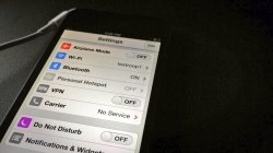
http://twitpic.com/cvxnh4

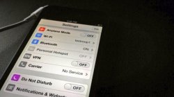
Posted on Twitter yesterday, probably someone's concept photo, but looks pretty well done and Apple-like, either way nothing new except a widgets settings...

Also no idea why the Do Not Disturb icon is purple, doesn't seem like something Apple would do.

Thoughts?

edit: As 'Peace' pointed out, there's no Wi-Fi icon, which makes this is most likely just a concept art.
 

Attachments

  • 779232280.jpg
    779232280.jpg
    49.7 KB · Views: 928
Last edited:
I think it looks awesome! Not a big fan of changing the UI (I like it how it is now) but that actually looks great! I wouldn't be surprised to know that it's legit and not a concept, it looks very polished and apple-like.
 
Hmm not sure what that "Edit" button is doing on the top right corner...but other than that it seems genuine.
 
Intéressent, but probably fake. However, I wouldn't understand why dove icons would have color and some others not. Seems weird. Interesting main color scheme.
 
Seems cool, but doubt it's real. I highly doubt Apple would change the colour of Do not Disturb from Blue to Purple.
 
Where's the "No Service" at the top left?
Looks like the network name doesn't appear anymore in iOS 7, remember the last leak?

http://www.idownloadblog.com/2013/06/02/unified-ios-7-icons/

It shows a WiFi network connected but no WiFi signal icon.

Fake
Good eye.

I found a higher quality version of the photo.

I translated the tweet: "iOS 7 UI leaked, to date, the potential of the concept of the best looking high. At the bottom of Widgets (Widget) also it is. estimated at Apple headquarters probably testroop1 WLAN. Vote on the UI comes as"
 

Attachments

  • BMLchOECMAADZCl.jpg
    BMLchOECMAADZCl.jpg
    63.5 KB · Views: 427
Why wouldn't it appear? It has since 2007

And why would some asian guy have iOS 7 leaks? Doesn't make sense at all
 
Considering there are sooooo many concepts out there I call fake on this one.
 
Intéressent, but probably fake. However, I wouldn't understand why dove icons would have color and some others not. Seems weird. Interesting main color scheme.

Actually (even is this is probably fake), having some icons color coded and some being gray make a lot of sense from a design perspective. It's a good way of putting the focus on the settings that somebody may use on a regular basis and not putting it on settings that are unlikely to be used often.

For example, in regular "use" it's normal to look for Wifi settings, bluetooth, airplane mode switch, do not disturb. On the other hand, settings like carriers, notifications settings, vpn, etc. aren't supposed to be used very often.
 
Intéressent, but probably fake. However, I wouldn't understand why dove icons would have color and some others not. Seems weird. Interesting main color scheme.

If you look it appears that the colorless ones are off. Which is a nice visual, however I still call concept or jailbreak theme due to one thing. Two schemes at play.

One thing I think Jony will definitely do is get everything on one system as much as possible. No more of this 'in this app you do, but in this app you do something different' like how it is all over the native apps. Or even between iPhone and iPad version. So a toggle for VPN but the rest are a tap to a set up screen not likely (double since that would change how it is now with little reason for the change). Either they will all go to a toggle and when it is on you tap for settings or they will all go select and get to a sub screen for all. Of the two I like the notion of a toggle and tap to refine myself
 
It's very easy to fake this, and also to fake the blurry home screen pic we've seen before. All you have to do is make the mockup, send the picture to the phone, and then open the picture. People seem to think because it's actually on the phone that it has a better chance of being real.
 
Looks like the network name doesn't appear anymore in iOS 7, remember the last leak?

http://www.idownloadblog.com/2013/06/02/unified-ios-7-icons/


Good eye.

I found a higher quality version of the photo.

I translated the tweet: "iOS 7 UI leaked, to date, the potential of the concept of the best looking high. At the bottom of Widgets (Widget) also it is. estimated at Apple headquarters probably testroop1 WLAN. Vote on the UI comes as"

Ok so the original tweet is in Chinese. The fact that the tweet uses the word "concept" makes me think fake. How would some random Chinese person have access to a phone with iOS 7 beta on it? :confused:

----------

Apple isn't going that flat. Their will still be gradients.

And you know this how?
 
Register on MacRumors! This sidebar will go away, and you'll see fewer ads.