Become a MacRumors Supporter for $50/year with no ads, ability to filter front page stories, and private forums.

bjb.butler

macrumors 6502a
Original poster
Aug 18, 2008
938
81
Southern California
I had been using iOS 7 beta 2 for nearly a week before I decided to revert to iOS 6. Not because of the instability of the beta itself, but 3rd party app instability; Facebook and FB Messenger, which I use heavily, kept signing me out throughout the day, so I wasn't getting notifications.

So I decided to downgrade late last night. When the restore was finished and I unlocked the phone, my eyes felt -- for lack of a better them -- "rested". It's kinda hard to explain. I remembered that some people were saying they were having trouble reading stuff within iOS 7, but I just assumed that while iOS 7 is slightly harder on the eyes, what I was experiencing was due to my eyes already being tired (it was after 2am). But today when I woke up and looked at my phone, I felt the same relief.

There are two things I think are worth noting:

I am 22 years old and have what people would call "perfect" vision. I don't need glasses, can read things across the room, etc.
While using iOS 7, I didn't think it was straining on my eyes. I only realized this after going back to iOS 6

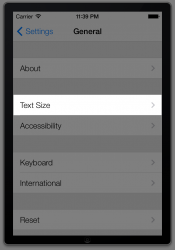
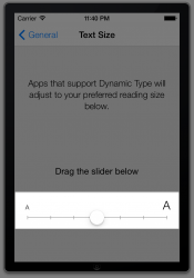
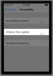
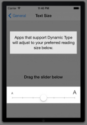
After using both, I can say iOS is much, much easier on the eyes (for me, at least). What can Apple do to improve the situation, make the font thicker/bolder? Has anyone else experienced this?
 

Attachments

  • ios6_ios7_home_screens (1).jpg
    ios6_ios7_home_screens (1).jpg
    1.1 MB · Views: 256
I believe there's an option to make the font bolder in Beta 2. Try 'Accessibility'.

Tried. As far as I can tell, it only changes text in app content. If it makes any change in UI text, it's so subtle I can't see the difference.
 
I don't think anyone can honestly argue that the fonts in iOS 7 are not harder to read. You may prefer the look of them, but the thinner and in some cases smaller fonts are definitely harder on the eyes. It is worse on the iPad mini as the title/status bar is way too small. So not only is it hard to read being smaller but looks really jagged with the non-retina display.
 
Your issues of legibility are perceived as such, and fixable.
 

Attachments

  • 1.png
    1.png
    103.5 KB · Views: 161
  • 2.png
    2.png
    109 KB · Views: 134
  • 3.png
    3.png
    108.9 KB · Views: 139
  • 4.png
    4.png
    109.5 KB · Views: 135
  • 5.png
    5.png
    111.4 KB · Views: 131
I'll let you do that, seeing as I'm working ;)

No, you are the one who claim these settings make a difference, even after I posted in this very thread that they don't. I think you should do the work to prove that they do. I'll be happy to wait until after you get off work.
 
No, you are the one who claim these settings make a difference, even after I posted in this very thread that they don't. I think you should do the work to prove that they do. I'll be happy to wait until after you get off work.

Nope. I'm done - I have nothing to prove to you. I don't "claim" anything - bolder text obviously makes a difference, I merely posted some screenshots to show people how to improve legibility.

Seeya.
 
I agree with you..at 45yrs old the new thin font makes it very hard to see...for example the badge on a text or email..its so neon and the number is so small..I cant tell how many it says...wasnt a problem in ios6.

I think the thin font is cool, but makes it very hard for me to see unlike in the past.

David
 
Nope. I'm done - I have nothing to prove to you. I don't "claim" anything - bolder text obviously makes a difference, I merely posted some screenshots to show people how to improve legibility.

Seeya.

Bold font will of course make text more legible, if only those settings you posted affected text anywhere other than app content.

I trust you now realize that those settings don't affect notification center or other UI text, and you won't be posting them again when people complain about legibility difficulties.

Please, don't talk down to me - that's uncalled for. I knew all along - I am a developer - it is more than obvious.

seeya :)
 
If you knew, why did you post? :confused:

Are you trying to prove/disprove something here? It matters to you, not to me - please take your own time and do the research.

[EDIT]

If folk cannot see a gigantic typeface, even in bold, then they need to consult an optician, not Apple.
 
Are you trying to prove/disprove something here? It matters to you, not to me - please take your own time and do the research.

[EDIT]

If folk cannot see a gigantic typeface, even in bold, then they need to consult an optician, not Apple.

And as i keep repeating ad nauseum, we only get gigantic typeface for app content (like the notes you write into Notes app), not the UI (like the New "not-button" in Notes app, or the Repeat / Shuffle "not-buttons' in Music app), or the text in Notification Center. Every time someone mentions that fonts in iOS 7 is harder to read, someone brings up accessibility settings, WITHOUT HAVING TRIED IT to see what it actually does.
 
Are you trying to prove/disprove something here? It matters to you, not to me - please take your own time and do the research.

[EDIT]

If folk cannot see a gigantic typeface, even in bold, then they need to consult an optician, not Apple.

It's all a misunderstanding. What Night Face is trying to say is the font change won't apply consistently, throughout the entire UI (the home screen, notifications, etc). Hopefully that will change before GM.
 
It's all a misunderstanding. What Night Face is trying to say is the font change won't apply consistently, throughout the entire UI (the home screen, notifications, etc). Hopefully that will change before GM.

Thanks for the calm, clear, non-disputatious post...finally!:D
 
Thanks for the calm, clear, non-disputatious post...finally!:D

Well, sorry about the drama, but I'm just so tired of people bringing up the accessibility settings, without first trying it themselves to see what it does (and doesn't) do. Typeface taking the time to do screenshots of the settings but not taking the time to see what effect the settings actually had was just the final straw, here.

Also, not too optimistic about this changing before GM. Coding to change the font size of UI elements seem like something that needs to be built in at a pretty basic level. But of course, I would be most delighted to be proven wrong on this point!

Friend, why do you have such a problem? I am a person - I am not a straw, and if I was, I wouldn't be the last straw! :D

I am not a disposable, dismissable research resource for you; you could just as easily have had the good grace to thank me for what I have provided, and accept that I am busy... but that seems an impossible task.

It's okay - I forgive you - but please - show some humility and manners - I don't owe you a single thing - you can easily do some research and take screenshots yourself.

Take care of yourself, thanks. :)
 
Friend, why do you have such a problem? I am a person - I am not a straw, and if I was, I wouldn't be the last straw! :D

I am not a disposable, dismissable research resource for you; you could just as easily have had the good grace to thank me for what I have provided, and accept that I am busy... but that seems an impossible task...

It's okay - I forgive you - but please - show some humility and manners - I don't owe you a single thing - you can easily do some research and take screenshots yourself.

Take care of yourself, thanks. :)

Did you even read any of the posts in this thread?

I don't need you to do research -- I know very well what those settings do and don't do. But after all this, I still can't tell if *you* know it. I was trying to get you to acknowledge that those settings you posted don't completely solve the legibility problem, because they don't change the font size or the font type in many places, like for instance the Notification Center.

Oh well. Hopefully other people who read this thread will get the point.

lol...you should give up. I'm starting to think he just chooses to be ignorant. the guy calls himself a "developer". :confused:
 
I am not sure what everyone is fighting about but those settings actually changed my text everywhere on the phone including homescreen and notification center ... screenshots coming shortly
 
Register on MacRumors! This sidebar will go away, and you'll see fewer ads.