After downloading the WWDC app and playing around with it, I'm about 99% sure this is what the new design language is for iOS 7. Just think about what all the rumors have been saying:
If you look at the design of the WWDC app it corroborates with all these design elements. As the events view resembles the calendar app a lot, just look at the difference it will make, without changing the way people are used to working with it:
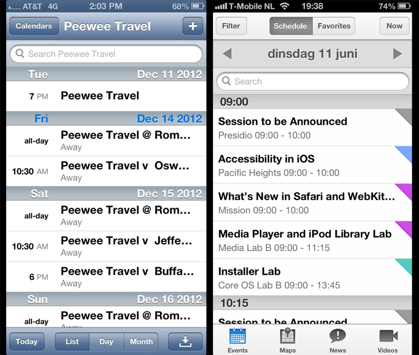
The top and bottom bars have such a small gradient that it's barely noticable, it's black and white with a highlight color (blue on the bottom), the buttons are flattened, etc.
Next to all the above named changes, subtleties like the highlighted icons on the bottom, instead of the typical buttons seem like a welcome change.
I think this is it")
- No gloss
- No gradients
- No shadows
- Black and white
- Flat
- Functionally not estranging
If you look at the design of the WWDC app it corroborates with all these design elements. As the events view resembles the calendar app a lot, just look at the difference it will make, without changing the way people are used to working with it:
The top and bottom bars have such a small gradient that it's barely noticable, it's black and white with a highlight color (blue on the bottom), the buttons are flattened, etc.
Next to all the above named changes, subtleties like the highlighted icons on the bottom, instead of the typical buttons seem like a welcome change.
I think this is it