Become a MacRumors Supporter for $50/year with no ads, ability to filter front page stories, and private forums.

decafjava

macrumors 603
Original poster
Feb 7, 2011
5,909
8,936
Geneva
I am curious as to whether the popularity of ipads and other tablets are influencing web design for desktops and some examples of such.

Look at this site:

http://www.adidas.com/us/homepage.asp

Most of the info is on the surface-there is a minimum of menus and all the info sldies out on mouse over.

What other examples of such sites are there and what do you think of this trend?
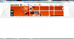
 
I don't have an iPad, but that site is designed for mouse input, as you can't hover with your finger over an element like you can with a mouse pointer.
With a finger you have to tap it, and to uncover elements that way would seriously hamper the usefulness for tactile input.

Also the site uses Flash, thus any iOS device will be useless anyway.
 
That site was designed + developed long before the iPad was released. (I was one of the developers working on it).
 
Nothing clicks and it looks like this:
 

Attachments

  • adidas.PNG
    adidas.PNG
    409.2 KB · Views: 109
To speak to the OP's original question, development for mobile is now big business, as mobile is estimated to overtake desktop internet usage by 2013-2014.

Google "responsive design" (a term I personally don't like) and take a look at some of the examples. Using media queries we can reformat HTML-pages based upon viewport size. Ethan Marcotte has a wonderful book called "Responsive Web Design" that covers both the theory and code behind it.

Lots of examples are around, but the new Boston Globe is an example of a large-scale implementation. Resize your browser window to "redesign" the page.
 
Thanks for the answers everyone. I should have been clearer perhaps but I was not talking about desiging for tablets as such-but more the graphical side of design that goes for simplicity, is icon-based and gets away from traditional menus and navigation. The addidas site is kind of the direction I mean-without the flash or the exact graphical layout-while I agree the link posted by jadedmonkey is pretty bad-the idea of using icons in place of loads of text is not.
 
Register on MacRumors! This sidebar will go away, and you'll see fewer ads.