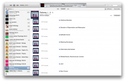
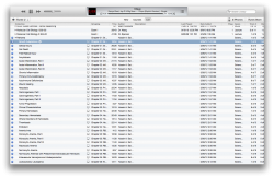
Ok no one is talking about this and maybe I'm just a gigantic geek, BUT iTunes U sucks. It's great if you have a course with just a few lectures (first pic) or something light maybe, but if you have several sources with well over 100 lectures, it's really aggravating to see such large, non-descriptive rows when in the "Courses" view (second pic). Now I could just use the list view (third pic) so I can actually see track number, disk number (which I use to separate chapters, sections, etc.), and grouping, but it auto-expands each course automatically anytime you switch between views. The list view also displays all courses together. it was just easier before and now it's a overly flashy mess. ugh, I guess I could try relabeling the media as podcasts again. dammit apple could you freaking decide how the f iTunes U should work?
Got a tip for us?
Let us know
Become a MacRumors Supporter for $50/year with no ads, ability to filter front page stories, and private forums.
iTunes U UGH!
- Thread starter jozeppy26
- Start date
- Sort by reaction score