Become a MacRumors Supporter for $50/year with no ads, ability to filter front page stories, and private forums.

mirzank

macrumors regular
Original poster
Apr 15, 2008
225
2
i loved beta 1 of ios 7 for its design. i loved the new font. i loved the borderless buttons. i loved the flashing battery charge indicator. i loved pretty much everything. i even loved the new icons. the flat design.

and since then apple has been taking away all the things i loved. yes, for usability sake for other people. and because there are people not as experienced as me that might be confused by changes, or might find thin text unreadable. so i sucked it up.

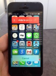
BUT THIS. what the #%#%**#%(* in the name of good design is this??

is this a bug?? i loved the fully stretched edge to edge shutdown and cancel buttons. i dont like the shrinked up ones. but this?? instead of the screen going dark, they are just overlaid on the normal screen.

who is the imbecile making these changes? does anybody at apple even use an iphone anymore??
 

Attachments

  • altered-slide-to-power-off.jpg
    altered-slide-to-power-off.jpg
    51.3 KB · Views: 211
This post just emanates intelligence… but I don't particularly like the new shutdown slider either… I feel so conflicted. :(
 
Who cares, how often do you turn off your device anyway?

Actually just to clarify, this isnt one of those "waahhhh im leaving apple steve jobs died tim sucks ios sucks".

I like the ecosystem and the simplicity enough that these things arent really that bothersome.

Im just trying to look at this objectively and think, what could they be thinking. With a lot of changes, even the ones i dont like, i can always see the designers point of view and what theywere trying to accomplish. And its understandable.

Its just something like this is so unlike apple. So jarring. So obviously odd. Thats why i mentioned it.
 
This post just emanates intelligence… but I don't particularly like the new shutdown slider either… I feel so conflicted. :(

It definitely AT THE LEAST needs to blur the background to make it look decent. Still got at least one more beta and then the GM. So we'll see
 
Yeah it's not like Apple had a rough or even slightly polished but still fairly unfinished design in place when beta 1 came out they they were still working on and planner on updating and tweaking as the beta process went on...oh, wait, that's actually exactly what it's like. Surprising? Not really, at least not to those who understand even at least the general software design lifecycle, especially when it comes to redesigns or brand new designs.
 
Im just trying to look at this objectively and think, what could they be thinking. With a lot of changes, even the ones i dont like, i can always see the designers point of view and what theywere trying to accomplish. And its understandable.
.

This would be my guess: The power off strips looked somewhat awkward on the ipad (one of the first things I noticed in beta 1). They've now stunk them to take only a small amount of space (only a thumb length now) and it looks much better IMO. They've probably just shrunk them on the iPhone too for consistency's sake.

If someone could post a before and after on the ipad you would see what I mean.
 
I thought the shutdown animation and size of the swipe bars was pretty slick in the previous betas, don't like the changes as much. Not a huge deal though since I never turn my phone off.
 
I actually really like the new shutdown buttons specifically because they don't reach the edge of the screen. I like it, it feels more polished.
 
Actually, I'm a bit worried about this change.

In beta 4, one could easily distinguish between a button and a slider. A slider was edge-to-edge, and a button was a ... button with rounded corners.

Now, the sliders have rounded borders too; this makes them look like a button.. Problem is, that you cannot tap it. You have to slide it.

This will confuse a lot of novice users; "It's a button.. Why can't I tap it??"

Sliders have the word "slide" mentioned and they have the shiny blinky arrow... Should be enough to distinguish I guess...

Yea but, I feel the background should get a lot more blurred... Like the notification centre maybe...
 
The borderless buttons looked ridiculous imo.

Glad things have a border now. I especially like the new slide to answer buttons in calls.
 
Yeah it's not like Apple had a rough or even slightly polished but still fairly unfinished design in place when beta 1 came out they they were still working on and planner on updating and tweaking as the beta process went on...oh, wait, that's actually exactly what it's like. Surprising? Not really, at least not to those who understand even at least the general software design lifecycle, especially when it comes to redesigns or brand new designs.

not sure how you code, but i bet its not putting out a product with no actual vision in your head for what it is.

These guys have templates and slides and graphical representation of what they wanted to present. they coded it. thats what you saw in beta 1. yes ofcourse changes happen. im not saying i didnt expect them to. im saying i didnt expect them to change what in my opinion seemed like well done elements of a design that looked polished. it seems more unfinished to me now than it did then. and im not talking performance. jsut design.

----------

I thought the shutdown animation and size of the swipe bars was pretty slick in the previous betas, don't like the changes as much. Not a huge deal though since I never turn my phone off.

yep very very slick. i used to love that android tv screen flicker off animation at shutdown. i thought apples new animation beat that.

and i agree, its not like this bothers me in the way. even if i saw it every day it wouldnt really bother me the way other seem to be bother by design changes.

I just like to look at nice things in my life, and it makes me happy to see perfection. the shutdown animation was one of those things. other aspects of ios are the same way. its just nice to see something done so well.
 
It's a much more polished implementation. Firstly, the screen behind the buttons dims. And then as you slide to power off, the screen fades away until it's black by the time you reach the end.

I didn't mind the look of the old buttons that used the full width of the screen but they were lacking any kind of response to the user when they slid their finger across.
 
I agree with you about the font and the pulsing lightning bolt when charging. Wish those would go back to how they were in beta 1. :(
 
Seems to me this is another case of a screen shot not telling the whole story. When I first saw the screen shot I thought WTF? Then I saw video of how it works and how the screen quickly fades to black and it didn't bother me at all.

Honestly I don't know what people are smoking if they really thought Apple would move away from rounded recs.

----------

I am not saying I like it, neither I dislike it. But why would someone get confused and tap on it rather then slide when it clearly reads on it slide to power off?

And has the little caret just like on the lock screen.
 
Apple redesigns iOS completely for iOS 7 and then in betas 4 and 5 starts regressing back to iOS 6 with rounded rectangles and arrows. :mad:

I wish I could keep running beta 3 if it wasn't for the call bug. The new settings menu looks significantly worse. The new arrow on the lock screen kinda bothers me, but I know that it's probably going to stay because people can't figure out which way to swipe.

The fact that they teased a whole new look and are slowly taking it away is frustrating!

Just curious why you think the settings menu looks significantly worse.
 
I hate rounded rects, they just look lazy.

If it were me I would have the power slider drop down exactly the same size as the dock edge to edge, blur the springboard and fade it a bit, keep the fade to black as you slide, and blur dock's icons while moving them underneath the dock onto the springboard revealing the cancel text directly on the dock in one quick animation.

it would look something like this:

mockup.png
 
Just curious why you think the settings menu looks significantly worse.

I personally think the new settings menu is much better (I didn't at first, but it grew on me quickly). The coloured icons are really nice and take away the dullness.
 
Register on MacRumors! This sidebar will go away, and you'll see fewer ads.