Got a tip for us?
Let us know
Become a MacRumors Supporter for $50/year with no ads, ability to filter front page stories, and private forums.
Leopard Icon/Box art
- Thread starter owl-boy
- Start date
- Sort by reaction score
You are using an out of date browser. It may not display this or other websites correctly.
You should upgrade or use an alternative browser.
You should upgrade or use an alternative browser.

mad jew said:I can see Apple moving towards that style but I doubt they'd outright copy the Windows symbol people. It still seems like we'll be seeing more of that flat grey look. I like it, that's why I use UNO.
Nice!! I am really starting to get tired of the whole "brushed metal" look of OS X. I like the new look they are going for with iPhoto, iTunes, etc. I am going to download and install this.......when I get back home.
I bet it's a Trademark thing. Legally, they probably couldn't use thee "real" windows logo without having to pay money. SO, the rotated it a few degrees and made it brushed metal.
mad jew said:I can see Apple moving towards that style but I doubt they'd outright copy the Windows symbol people. It still seems like we'll be seeing more of that flat grey look. I like it, that's why I use UNO.
thanx for giving me the info on uno it works great and makes everything look great
That look more of a windows thing than a X...i think they will stick to the black box with the big X on it....just change the script.
Bless
Bless
Benjamin said:nope... this is what it will probably look like.
Thanks, I was just about to dig that up.
Benjamin said:nope... this is what it will probably look like.
I hope that is not the look of the Leopard discs, they look so plain. I love the look of the Tiger discs, with the spotlight in the middle, really gives a quick idea of what is new in this version.
wwooden said:I hope that is not the look of the Leopard discs, they look so plain. I love the look of the Tiger discs, with the spotlight in the middle, really gives a quick idea of what is new in this version.
How do we know what new features Leopard is packing? Maybe Leopard is introducing iBondage, what with the leather straps and all on the disc...
owl-boy said:does any1 else think that the icon for bootcamp might lead to the icon/box art for leopard?
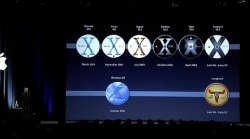
Notice the "X" in the middle of the 4 boxes?
who said that? dvorak?
I had the feeling/thought that Apple made the Boot Camp Windows logo grayscale to subtly put it down in comparison to Mac OS X. The Mac logo is a colored smiling face, while the windows logo is plain, boring, grayscale squares. It sort of fits in with the whole "dull little boxes, dull little tasks" thing.
mduser63 said:I had the feeling/thought that Apple made the Boot Camp Windows logo grayscale to subtly put it down in comparison to Mac OS X. The Mac logo is a colored smiling face, while the windows logo is plain, boring, grayscale squares. It sort of fits in with the whole "dull little boxes, dull little tasks" thing.
Too bad the icon isn't 8 bit huh?
markkk! said:Too bad the icon isn't 8 bit huh?
That would be a slap in the face!
I like it.
Sharewaredemon said:That would be a slap in the face!
I like it.
I like it too, but I think I'm gonna make one with color instead...anyone want it?
markkk! said:I like it too, but I think I'm gonna make one with color instead...anyone want it?
sure...sounds good
but if you made one in grayscale that would be cooler
Andrew7724 said:does anyone know when is it coming out?
details will be announced at the wwdc
august 7-11
http://developer.apple.com/wwdc/
I think it is interesting that the icon they used for windoze is black & grey. Maybe refering to the blandless, lack of personality and lack of culture?
Just a thought.
Just a thought.
Register on MacRumors! This sidebar will go away, and you'll see fewer ads.