Become a MacRumors Supporter for $50/year with no ads, ability to filter front page stories, and private forums.

kkclstuff

macrumors 6502
Original poster
Apr 18, 2015
446
316
NYC
I ve posted in a few other threads but wanted to start a specific thread for those of us with vision issues.

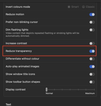
For me, the Liquid Glass is too blurry to see any text and the background bleed-through is TOO prominent. Reduce Transparency 'flattens out' the GUI but it then affects other components like Safari windows tool bar—tools now float or are 'weirdly' shadowed. The windows on screen have no definition when stacked on top of each other, etc etc
Screenshot 2025-09-20 at 8.01.29 PM.jpg

I'd like LOVE to see  give the enduser a Setting 'slider' to control the amount of transparency instead of toggle ON/OFF.

What have you experienced and how are you adjusting Settings to cope? (Im currently using dark mode—which doesnt help my vision issues—and reduced transparency)
 
Last edited:
Edit: I misread your post (apologies)

Yes, like all things good/bad, contacting Apple/Feedback should be everyone's 1st stop.

PS I haven't heard back though its only a day or two.
 
Last edited:
I am vision impaired as well so I feel your pain, its one reason I havent upgraded

If you go to Apple Menu >System Settings>Accessibility >Display>Look for Reduce Transparancy - Turn that on. See if that helps

That will also make the menu bar look solid colour
 

Attachments

  • Screenshot 2025-09-21 at 10.11.27 am.jpg
    Screenshot 2025-09-21 at 10.11.27 am.jpg
    124.4 KB · Views: 18
I'm in the same boat as you, except I prefer dark mode. I use dark icons and widgets and that mostly works for me, except for the control panel. I don't know why the other drop down panels are mostly opaque while the control panel is mostly transparent. I guess they decided to get their liquid glass freak on with the control panel lol.

Turning on reduce transparency has its own drawbacks, as you pointed out. So for now I leave it on and deal.

I think the issues with a transparency slider are 1) Apple seems to be allergic to giving people that level of control. They decide what's good and want you to accept it. They give you an out with the accessibility option but that's it 2) it creates more work for devs to test to make sure their UI work ok with all different levels of transparency.

Can't do anything with #1 but for #2 they can just cap the max transparency at whatever they think is the right one and min at whatever reduce transparency is. I recall that in early betas they had more transparency but backed off after all the complaints. Well, they can set the max and default at the level they had originally before the great unwashed threw a hissy fit, and with the slider the plebs can turn it down to what they can handle (those who want even more transparency are obviously deranged and can be ignored). This way, devs just have to test the min and max values, just as they do now with normal and reduced transparency. The in between range will take care of itself.
 
  • Like
Reactions: !!! and kkclstuff
Trying to embrace the situation best I can, Ive been experimenting with Dark mode and Display backlight. yesterday I toggled OFF Reduce Transparency, it's been ok with a lower backlight. I think for me its a catch22 of not clearly seeing the dropdown menus and ControlCenter (background bleeding) or no definition of layered windows and the 'floating' or heavily 'shadowed' toolbars.

I think I'll experiment with changing the color sets to more of a charcoal or dark grey instead or dark or light (but not sure how much I can change the color themes. Is tehre a 3rd party app for that?🤔

Surprisingly most of my issues are in the finder and safari, other apps - Logic Pro, Mail, etc are fine/ok.
 
I agree that I that there should be more finer controls. I have reduce transparency turned off and in most places it's ok for me but notification center feels too transparent. I wish I could change just that.
 
  • Like
Reactions: kkclstuff
I thought a few of my apps were missing controls (this is Messages) till I realized they were hidden with Reduced Transparency (bad color pickers!!)
THIS should not be considered acceptable:
Screenshot 2025-09-23 at 5.52.35 PM.jpg


here's examples of different visibility of a window/toolbar with different settings Dark/Light/etc
Screenshot 2025-09-23 at 5.52.26 PM.jpg


Screenshot 2025-09-23 at 6.01.39 PM.jpg


Screenshot 2025-09-23 at 6.01.46 PM.jpg
 
  • Love
Reactions: turbineseaplane
I have reduce transparency on and while its ugly as sin it does improve the contrast for control center.
 
yes definitely, but to all be forewarned that some input interface icons disappear/fade/dissolve

This happens alot (for example... in Logic Pro Mixer/dbfs scale and Home Climate readings) the fonts are too similar to the background and/or a very small font. I get they are moving to more icon based interface, but there needs to be contrast with interface and data objects.

(why were these not designed to change to contrasting colors in Dark and or RT modes?)🤔
 
…it creates more work for devs to test to make sure their UI work ok with all different levels of transparency….
You may be onto something there.

What property should a slider modify of this imaginary glass material? Maybe it’s more than just transparency?

Maybe refractive index, material thickness, and color/tint need to be taken into account too? Then there’s “True Tone”” on Mac displays where the display reacts to ambient light conditions. Does that also need to be worked-in? Should the glass buttons be reflecting more (or less) of your room’s ambient light back at you?
 
Last edited:
I think it may be a combination of both DC/RT (and maybe how LG interacts with backlight,TT, etc).

In updates, I'd love to see more control (I'll leave 'the how' to devs) but would be VERY GRATEFUL for just more logical contrast of action buttons, menus, and text from background objects (as illustrated above). (ie: if its a light background give us bold(er) or dark text and visversa)

PS my emphasis above is for any  team member that may stumble across this post 😅
 
I decided to leave reduce transparency OFF and just don't rely on control center.
A clever tip I saw recently is having the action button open a collection of shortcuts that have the functionality of control center controls. Then you're not dealing with the transparency.
 
Register on MacRumors! This sidebar will go away, and you'll see fewer ads.