Not sure this is the right category, since this touches all OSes and not just iOS — feel free to move it if needed.
I wanted to share some early impressions of the new Liquid Glass UI Apple introduced yesterday. I installed the betas across devices and… I’m quite conflicted.
Quick background: As a product front-end developer, I'm really into design, user experience, and human-machine interfaces, so I’m usually excited to explore new concepts and changes. But as it stands now, I’m not convinced this is the best direction.
Of course, it’s early days, and the current implementation is still very glitchy, which definitely affects the overall experience. I’ll revisit my opinion closer to the official release this Fall. But for now, here are my first thoughts across platforms:
iPhone (iOS):
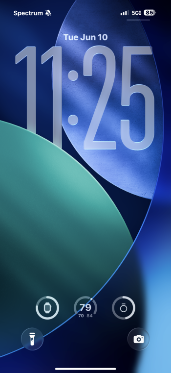
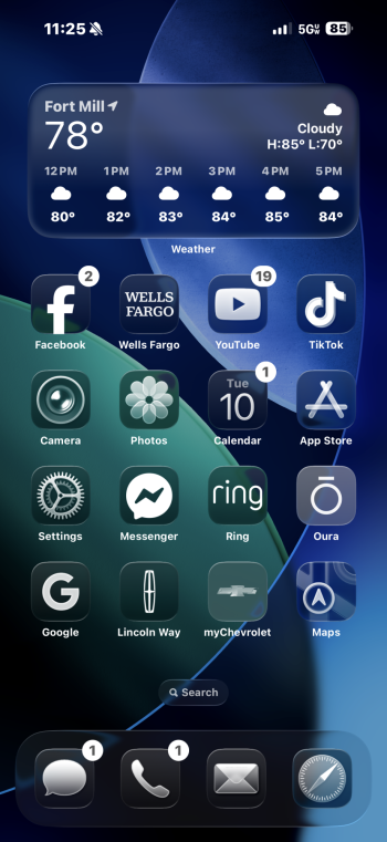
With some refinements, the new design could work here. I do like that many controls have been moved to the bottom of the screen — that’s a solid UX choice. However, contrast and legibility are currently a big problem. This is an issue that carries over to other OSes too.
iPad (iPadOS):
I haven’t spent a ton of time on the iPad yet, but from what I’ve seen, apps like Mail and Music feel overcomplicated. With the new Menu Bar and more layered navigation patterns, the UI is starting to feel unnecessarily complex. And since iPadOS still doesn’t run full desktop apps, I’m unsure how useful the Menu Bar really is. Over the years, Apple seems to have added more and more interaction models without phasing out older ones — the result is starting to feel chaotic.
Mac (macOS):
This is probably where I’m most disappointed. As someone who relies on macOS for pro work, I do want it to look modern — but the current implementation of Liquid Glass feels oddly dated and overly flashy. For example, Safari dynamically changes its appearance based on the site you're visiting, complete with animations — I find that more distracting than helpful. There are also various glitches like overlapping UI elements and random dividers, which really shouldn’t be there.
To be fair, major redesigns often take time to settle. The iOS 7 refresh needed a couple of years to feel polished. On the flip side, Big Sur introduced a new look that remained mostly untouched — and some questionable decisions made then were never addressed. This new redesign does fix some old issues, but it also introduces quite a few new ones — and many are worse.
Curious to hear your thoughts — what do you think about Liquid Glass?
I wanted to share some early impressions of the new Liquid Glass UI Apple introduced yesterday. I installed the betas across devices and… I’m quite conflicted.
Quick background: As a product front-end developer, I'm really into design, user experience, and human-machine interfaces, so I’m usually excited to explore new concepts and changes. But as it stands now, I’m not convinced this is the best direction.
Of course, it’s early days, and the current implementation is still very glitchy, which definitely affects the overall experience. I’ll revisit my opinion closer to the official release this Fall. But for now, here are my first thoughts across platforms:
iPhone (iOS):
With some refinements, the new design could work here. I do like that many controls have been moved to the bottom of the screen — that’s a solid UX choice. However, contrast and legibility are currently a big problem. This is an issue that carries over to other OSes too.
iPad (iPadOS):
I haven’t spent a ton of time on the iPad yet, but from what I’ve seen, apps like Mail and Music feel overcomplicated. With the new Menu Bar and more layered navigation patterns, the UI is starting to feel unnecessarily complex. And since iPadOS still doesn’t run full desktop apps, I’m unsure how useful the Menu Bar really is. Over the years, Apple seems to have added more and more interaction models without phasing out older ones — the result is starting to feel chaotic.
Mac (macOS):
This is probably where I’m most disappointed. As someone who relies on macOS for pro work, I do want it to look modern — but the current implementation of Liquid Glass feels oddly dated and overly flashy. For example, Safari dynamically changes its appearance based on the site you're visiting, complete with animations — I find that more distracting than helpful. There are also various glitches like overlapping UI elements and random dividers, which really shouldn’t be there.
To be fair, major redesigns often take time to settle. The iOS 7 refresh needed a couple of years to feel polished. On the flip side, Big Sur introduced a new look that remained mostly untouched — and some questionable decisions made then were never addressed. This new redesign does fix some old issues, but it also introduces quite a few new ones — and many are worse.
Curious to hear your thoughts — what do you think about Liquid Glass?