Got a tip for us?
Let us know
Become a MacRumors Supporter for $50/year with no ads, ability to filter front page stories, and private forums.
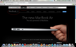
MacBook Air Product Page, URGH!
- Thread starter jamied95
- Start date
- Sort by reaction score
You are using an out of date browser. It may not display this or other websites correctly.
You should upgrade or use an alternative browser.
You should upgrade or use an alternative browser.
Looks fine aside from the hand, but there's nothing you can do about that. I think you just want something to bitch about.
This particular page just looks so messy
Tips:
1. Use Safari
2. Don't maximize your browser horizontally, websites don't need that space.
3. Move your dock to the side, more vertical space for the browser and website.
4. Buy the MBA already, you know you want it.
5. That hand is magic, deal with it.
Have a good day.
Looks fine aside from the hand, but there's nothing you can do about that. I think you just want something to bitch about.
Everyone loves a good bitch. Also, it does look messy, you know that tool on Word, where you can transparetify a colour, but it never looks clean and sharp? It looks like they used that and slapped it on a black background (the nav bar...)
Why did they go for the grey around the screen instead of the sleek black? Kerfuffles me...
I don't think we can take design advice form someone who uses a word like transparetify.
It needs blinking, colored text, and a busy graphic background -- maybe one of those "magic eye" pictures. These new-fangled web sites are way too slick.Everyone loves a good bitch. Also, it does look messy, you know that tool on Word, where you can transparetify a colour, but it never looks clean and sharp? It looks like they used that and slapped it on a black background (the nav bar...)
Why did they go for the grey around the screen instead of the sleek black? Kerfuffles me...
This particular page just looks so messy
Not to be a jerk, but have you looked at your (translucent) menu bar?
Tips:
1. Use Safari
2. Don't maximize your browser horizontally, websites don't need that space.
3. Move your dock to the side, more vertical space for the browser and website.
Take Note. That's good advice.
I'm not a multibillion dollar company. I think they could have just maybe done something so that the nav bar didn't flow into the oage - it looks ugly. And the hand, usually it's ok, because there's a border or something. ANd my Menu Bar, I hate it, but don't understand it, so just leave it
People. The hand is fine. It is. All of you have failed to notice one very obvious thing, the hand is not cut off.

If you go to the front page, they actually just display a quick splash with the entire image and the site navigation then fades in, cutting off part of the splash image and the hand.
Seriously, that is why Apple did it like that, so that the fade splash looks good.
Apply at Apple if you think you can do better or better yet, post up some of your work or how you would have achieved the same effect.
I don't think we can take design advice form someone who uses a word like transparetify.
lol!
Yeah, the page loads with a full screen image, which fades away to the white background, image, and navigation bar after a few seconds. The background isn't supposed to be black. Looks like the problem is with your specific browser settings, not Apple. That makes this thread even more pointless than I initially thought.
Register on MacRumors! This sidebar will go away, and you'll see fewer ads.