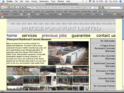
The big picture underneath header (h3) is a slideshow, the problem is I would like my slideshow flush at the top and the header to wrap around that. Originally I had a problem with the paragraph placed very strangely by the header, so I inserted a <br></br>.
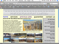
I floated my slideshow to the right, and I'm happy with the text flowing underneath it. Any input appreciated, site is coming close to being finished, big thanks to Angelwatt, and Jim.
Any input appreciated people; layout is a vicious beast Any help is appreciated.
I floated my slideshow to the right, and I'm happy with the text flowing underneath it. Any input appreciated, site is coming close to being finished, big thanks to Angelwatt, and Jim.
Any input appreciated people; layout is a vicious beast
Any help is appreciated.
HTML:
<div id="page_content">
<h3>Formwork RC Heat-Efficient Roof more text here it now</h3>


<div id="case">
<div id="slid_mid">Waterproof Concrete Basement Loading...
<script type="text/javascript">
  //<![CDATA[
  function LoadSlideShow() {
    var feed  = "http://picasaweb.google.com/data/feed/base/user/preciseformworklimited/albumid/5373908300495958129?alt=rss&kind=photo&hl=en_GB";
    var options = {displayTime:2000, transistionTime:600, scaleImages:true, pauseOnHover:false};
    var ss = new GFslideShow(feed, "slid_mid", options);scaleImages :true;}
  google.load("feeds", "1");
  google.setOnLoadCallback(LoadSlideShow);
  //]]>
</script>
</div>
</div>

<br></br>
<p>Peri Decking used to support 'Bubbledeck' heat-efficient roof. Air is trapped inside the plastic balls and retains heat for longer. The neccessary Decking was erected to details of supplied drawings, the 'Bubbledeck' was delivered to site and lifted in with a crane. The 'Bubbledeck' has a pre-cast concrete base which was temporarily held in position by the Peri Decking. Steel-Reinforcement was fixed in position by qualified Steel-fixers and neccesary Formwork was fixed. Concrete was poured forming a 200mm slab ontop/ attached to the 'Bubbledeck', this Reinforced Concrete is what held the slabs/ 'Bubbledeck in position' once Peri Decking was removed.</p>


<div class="spacer"></div>
HTML:
a {
text-decoration:none;
}

body {
padding:0px 0px 0px 0px;
margin:0px 0px 0px 0px;
background-color:#FEFFD9;
}

#container {
position:relative;
width:900px;
height:100%;
margin:0px;
padding:0px;
margin-left:auto;
margin-right:auto;
border:0px;
background-color:#FEFFD9;
}

#masterhead {
background-image:url(images_site/Graphics/logo_web.gif);
width:900px;
height:118px;
padding:0px 0px 0px 0px;
margin:0px;
}
#masterhead {
margin-left:auto;
margin-right:auto;
}

ul#nav_list li.no_pad {
padding:0px 0px 5px 0px;
margin:0;
float:right;
}

ul#nav_list{
list-style:none;
margin:0px;
padding:0px;
padding:0px;
font-family: "Lucidia Grande", Lucida Sans Unicode, Verdana, sans-serif;
font-size: 1.8em;
}
ul#nav_list li{
display:inline;
padding:5px 30px 5px 0px;
}


.spacer {
clear:both;
}

#slideShow_1 {
  width : 335px;
  height: 197px;
  padding-right:10px;
  margin-left: 0px;
  margin-top: 0px;
  float:left;
}

#slideShow_2 {
  width : 335px;
  height : 197px;
  padding-right:0px;
  margin-left: 0px;
  margin-top: 0px;
  float:left;
}

#sidebar ul {
list-style-type:none;
font:1em "Lucidia Grande", Lucida Sans Unicode, Verdana, sans-serif;
margin:0px;
padding:0px;
border:1px solid #000;
float:right;
}

#sidebar li {
background: #CCC;
width:200px;
padding-top:0.5em;
padding-bottom:0.5em;
padding-right:0.3em;
border-bottom:0.1em solid#666;
text-align:right;
}

#footer {
width:900px;
padding:0px;
margin:0px;
}

#page_content {
	width:680px;
	padding:0px;
	margin:0px;
	float:left;
	border:1px solid #000;
}

.sometext_mid   {
	float: left;
	width: 220px;
	text-align: center;
	padding-right: 10px;
	padding-left: 10px;
	padding-top:5px;
	padding-bottom:5px;
	font-family:"Helvetica Neue", Helvetica, Arial, sans-serif;
}

.sometext   {
	float: left;
	width: 220px;
	text-align: center;
	padding-top:5px;
	padding-bottom:5px;
	font-family:"Helvetica Neue", Helvetica, Arial, sans-serif;
}


.thumbnail {
width:134px;
height:80px;
float:left;
border:none;
padding:0px 2.4px 5px 0px;
}

img {
border:none;
}

h1 {
font-family:"Lucida Grande", Lucida Sans Unicode, sans-serif;
font-size:20px;
line-height:0.3em;
}
h3 {
padding:0;
margin:0;
float:left;
}

p {
font-family:"Tahoma", Verdana, Helvitica, sans-serif;
font-size:14px;
}

#slid_mid {
  width : 335px;
  height: 197px;
  padding:3px;
  margin:0 10px;
  float:left;
  border:1px solid #CCC;

}

#centre_slide {
position:relative;
float:right;
}

#case {
float:right;
margin-top:0;
}