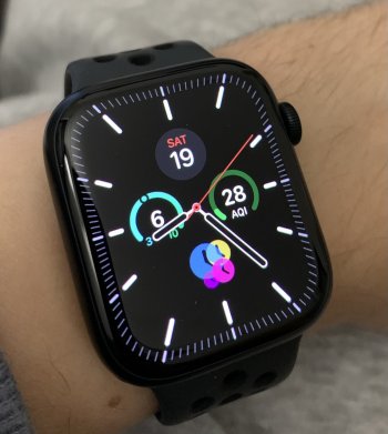
So who else agrees the black Meridian watchface looks better in AOD mode with white clock hands (left pic) than in non-AOD mode with black clock hands (right pic)??
Much easier to read the time with white clock hands on black background… wish Apple would enable users to choose the color of clock hands as well!
Much easier to read the time with white clock hands on black background… wish Apple would enable users to choose the color of clock hands as well!