Become a MacRumors Supporter for $50/year with no ads, ability to filter front page stories, and private forums.

css1323

macrumors regular
Original poster
Jul 15, 2008
124
10
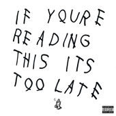
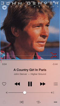
The one thing I'm really annoyed about with 8.4 is how album artwork gets darkened or fades out from the very top. The artwork itself collides with the cell reception and battery level meters as well in some bad cases. (Attached are some generic screenshots from doing a search)

To me, that's just really bad design and aesthetics. I spent many hours finding and applying a lot of the artwork manually for my CD collection. Having my artwork altered in any way is not pleasing, you just don't touch that. Will just be one of those things I'll have to get used to I guess.

This reminds me of the iPod Classic GUI. Finding any album through Cover Flow mode, or browsing by Album showed the artwork clear and fine, but once you selected an album to actually play the artwork would zoom out and turn blurry. Seeing if anyone else agrees here so far. Thanks!
 

Attachments

  • Drake (Normal Album Artwork).jpeg
    Drake (Normal Album Artwork).jpeg
    6.6 KB · Views: 306
  • Drake (Album Artwork Darkened with iOS 8.4).jpg
    Drake (Album Artwork Darkened with iOS 8.4).jpg
    85.2 KB · Views: 571
Last edited:
  • Like
Reactions: motulist
I'm glad I'm not the only one! It was clever to try and blend the status bar into the artwork, but they didn't think about how the MAJORITY of album covers use that top space. Another thing I'm noticing just looking through my library right now is how many covers already have vignetting to begin with.
 
It's even worse on the 4s - just tiny album covers and grey sides if the artwork isn't square! :( I hate it!
 
Doh! Just stated a new thread complaining about this status bar issue. My bad. But yeah it's terrible.
 
Yeah I'm not too bothered but it does make lighter colored album covers look bad, like OPs example. iOS favors edge-to-edge images wherever possible, and having a separated status bar goes against how it works everywhere else in the system.

But anyway, perhaps they should have the album art stop before the status bar, and fill the status bar with the same gradient used below. Make sure to submit feedback.
 
This is by design. They mentioned in in the keynote. It's so you can see the album artwork better and feel more immersed in the music. Who really cares to see the status bar there? Just go to the home screen.
 
This is by design. They mentioned in in the keynote. It's so you can see the album artwork better and feel more immersed in the music. Who really cares to see the status bar there? Just go to the home screen.

What did they mention in the keynote exactly? I think you misinterpret the point of this thread. It's not seeing the status bar. It's that making concessions to the status bar makes the album art ugly, harder to see, and is less immersive not more. I'd rather the status bar just be hidden if we're talking about immersion.
 
I can't remember exactly but I think something was said about the beautiful album artwork anyways yes I agree it would be better if they just hid the SB elements as it can look very wonky with many different artworks. It kind of reminds me of the messages app bug (pre ios 8.2) where you could see the SB elements while viewing a zoomed picture within the messages app. It just looks weird IMO too.
 
This is by design. They mentioned in in the keynote. It's so you can see the album artwork better and feel more immersed in the music. Who really cares to see the status bar there? Just go to the home screen.

That sort of begs the question though.

It's nice to share with others how they feel about the Music update, not the only one. I don't have any other real quarrels aside from the 'now playing' UI change. The rest of the app is refreshing, and shakes things up a bit -- an iPhone user since '08 now.

I've been quite patient with Apple's iOS updates, and I really don't expect them to listen to the little things like my very topic of discussion. Just going back to the 'home screen' is a tad insulting and very apologetic-sounding.
 
Register on MacRumors! This sidebar will go away, and you'll see fewer ads.