Got a tip for us?
Let us know
Become a MacRumors Supporter for $50/year with no ads, ability to filter front page stories, and private forums.
new App Store
- Thread starter jasonforisrael
- Start date
- Sort by reaction score
You are using an out of date browser. It may not display this or other websites correctly.
You should upgrade or use an alternative browser.
You should upgrade or use an alternative browser.
On the iPhone, it looks bad. It looks better on a larger screen, such as the iPad.
I could see that. It definitely does not belong on the iPhone. From what I've seen of Android, it looks it's Market. Again, like a bad webpage.
When I first loaded Beta 2 earlier today it had the same exact app store design as Beta 1, which im sure is what your all are referring too! After a phone reboot I noticed my app store has not reverted back to the old look from iOS 5 with a lot more black coloring.
Not sure why this but has anyone else seen this happen?
Not sure why this but has anyone else seen this happen?
When I first loaded Beta 2 earlier today it had the same exact app store design as Beta 1, which im sure is what your all are referring too! After a phone reboot I noticed my app store has not reverted back to the old look from iOS 5 with a lot more black coloring.
Not sure why this but has anyone else seen this happen?
Same here.
Same here.
Weirdly now its back to the newer one. I am wondering if Apple is making changes currently.
I think the design of a lot of the built in apps clearly lend themselves to the rumored taller screen of the next iPhone. Things simply look "cut off" in many instances, such as the new app store.
I think it's a bad choice though...the only people who will have a nice view are those that buy new iPhones?
I think it's a bad choice though...the only people who will have a nice view are those that buy new iPhones?
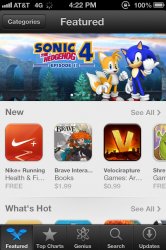

^That's what my App Store looks like currently.
Mine has since gone back to Post 10's picture. Mine only stayed the second version for about 20 minutes. I rebooted my phone and it was back after.
Not sure what the deal is.
Mine has since gone back to the fist pictures version. Mine only stayed the second version for about 20 minutes. I rebooted my phone and it was back after.
Not sure what the deal is.
Yeah I edited my post and meant that my App Store looks like the first picture you posted. I haven't seen the my App Store look like the second picture you posted.
Maybe Apple is doing some tweaking behind the scenes.
And this is the version from like 45 minutes ago
So thats the new store? Glad they got rid of the genius tab from the bottom middle in beta 1.
This picture was earlier this afternoon of the app store in its newer design
This is a perfect example of what I was talking about. Clearly the new iPhone will have two full rows of apps visible. It just looks and feels a little cramped on the 4S (and by extension, everything else I guess).
my app store is the same as beta 1, and i have turned my phone on and off a few times.
i kind off like the new look
i kind off like the new look
I actually like the look of the app store in post #10 minus the Genius button. It could use some polishing up though. I'm sure it will change 5 more times before GM.
Dont like how the search is still a button at the bottom.
Think it should be integrated in the header like in Notes. Swipe down to reveal search bar.
Think it should be integrated in the header like in Notes. Swipe down to reveal search bar.
And this is the version from like 45 minutes ago
Also note the two tone colouring looks very similar to the leaked iPhone shell colours.
Also note the two tone colouring looks very similar to the leaked iPhone shell colours.
Ahhh, good catch sir. Never thought about that.
Register on MacRumors! This sidebar will go away, and you'll see fewer ads.