Become a MacRumors Supporter for $50/year with no ads, ability to filter front page stories, and private forums.

MacAztec

macrumors 68040
Original poster
Oct 28, 2001
3,028
1
San Luis Obispo, CA
My brother just made a webpage for a his new company. 4-DAV, 4-d Audio/Video. I was wondering if you guys could help him out a bit, give him some feedback on the page. He just made it yeterday, and has only worked a total of about 4 hours on it. Hes no expert, and he needs some help.

Thanks!

Heres the link...

www.4dav.com
 
Logo

If someone could help make him a logo, it would really be great. I am not very good in photoshop, and neither is he. Something like:

A 3-D Cube with the letters 4 and D on the sides. Grey/Silver/Black are the preferred colors. Use your imagination...
 
I had a quick look at it. Not bad for 4 hours work. Just a few things I noted:

*On the main page, there's a mouse over image and a link for the Home image on the left. On every other page, there is no mouse over image for the respective page (eg on the Services page there is no mouse over image or link for Services).

*The text 'Taking Your Home Theatre To The Next Dimension' could be aligned differently. As it is it looks strange when the page title is indented so much, and the slogan is not. Also perhaps the page title could have the same alignment as the page contents.

*On the Services page, there should be a gap before [and after in some browsers] 'Including Projection, HDTV, and Surround Sound'.

*It may just be me, but IMO it would look better to remove the Home link at the top left of the page and move the Feedback link to the left column.

*The Feedback page and mail link at the bottom seem to have the same purpose. Maybe the mail link should be replaced by a link to the Feedback page, and/or the email link be added to the Feedback page as an alternative.

*Get the page validated at http://validator.w3.org/. This will make the site more likely to work and look the same in all browsers (already there are differences, eg there is more space between the links on the left and the page contents in Safari than IE).
 
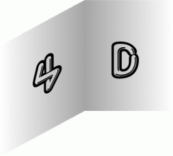
I was just playing with an idea but it's unfinished.
 

Attachments

  • 4DOutlines.gif
    4DOutlines.gif
    44.4 KB · Views: 108
bousozoku said:
I was just playing with an idea but it's unfinished.

That looks cool. I know you are unfinished (as you said), but is that going to look like a 3d cube when its done? I can kinda see resemblance now, but not much. And, just some feedback...the "4" kinda looks like an S or an 8. Good concept though.
 
I would agree that this isn't bad for 4 hours of work. After a quick click-through here are some things I noticed.

- Use a different background, preferably a plain color. The binary themed backgroud is too busy and makes the text difficult to read. It was starting to give me a headache.

- Place the contact form (found on each of the service pages) in its own section. Perhaps called "Contact". It's more intuitive to look there than its current location. Especially if this is how perspective clients are to contact him.

- Each of the services don't necessary need to be in the main navigation to the left if there is a "Services" section. Less options in navigation make it easier to browse. Just be sure make each service sub-section easily navigatable, meaning make it easy for people to get to each of the services pages as well as the main services page.

- Integrate the "Home" and "Feedback buttons at the top of each page into the main navigation to the left. There already is Home there so no need for it at the top. One place for site navigation is less confusing to people.
 
Register on MacRumors! This sidebar will go away, and you'll see fewer ads.