Got a tip for us?
Let us know
Become a MacRumors Supporter for $50/year with no ads, ability to filter front page stories, and private forums.
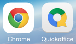
New Google Chrome icon iOS 7
- Thread starter nikicampos
- Start date
- Sort by reaction score
You are using an out of date browser. It may not display this or other websites correctly.
You should upgrade or use an alternative browser.
You should upgrade or use an alternative browser.
The did that with their Hangouts icon a long time ago already. I think the Gmail icon in some places in the App Store changed sometime earlier as well, just not the actual app icon when installed for some reason. Even now it seems that some places in the App Store icon for Chrome is still the old "3D" one, while other places show the new one. Inconsistency is key. 
Huh. Nice catch I hadn't noticed. I hardly use chrome though. Too buggy and kludgy, even the android version.
----------
Actually now that I think about it, most apps made in house by both google and apple are awful, though google's are like ten times more buggy.
----------
Huh. Nice catch I hadn't noticed. I hardly use chrome though. Too buggy and kludgy, even the android version.
Actually now that I think about it, most apps made in house by both google and apple are awful, though google's are like ten times more buggy.
Various apps could be better for sure, but they aren't all bad or buggy. Google Maps is generally quite good. Chrome is fairly good too for most people. Google Earth and Translate are generally fine. Apple's apps have some bad apples (pun intended), but various others are fairly good as well.Huh. Nice catch I hadn't noticed. I hardly use chrome though. Too buggy and kludgy, even the android version.
----------
Actually now that I think about it, most apps made in house by both google and apple are awful, though google's are like ten times more buggy.
YES, FINALLY! Have they done it with YouTube yet too?
Not yet, but hopefully they will follow that design, it goes more accordingly to iOS 7, which is nice.
The did that with their Hangouts icon a long time ago already. I think the Gmail icon in some places in the App Store changed sometime earlier as well, just not the actual app icon when installed for some reason. Even now it seems that some places in the App Store icon for Chrome is still the old "3D" one, while other places show the new one. Inconsistency is key.
That's because developers can change the appearance of the icon that shows in the app store, versus the one actually installed.
Right, but even within the App Store things are inconsistent. On search results one icon can show up, on the details page another one, on the updates perhaps another. They certainly can have different ones show up, but it doesn't seem all that rational and/or beneficial to do it.That's because developers can change the appearance of the icon that shows in the app store, versus the one actually installed.
Some like having quick ability to request a desktop version of a site, which Chrome has provided for a long time, while Safari should only be getting in iOS 8. Some like some integrations between various Google apps.Other than syncing bookmarks across Chrome on other platforms, can anyone explain to me the appeal of using Chrome on iOS?
Safari is so much faster.
Here's why: http://googlesystem.blogspot.com/2013/05/chrome-for-ios-not-fast-browser.html?m=1
Some like having quick ability to request a desktop version of a site, which Chrome has provided for a long time, while Safari should only be getting in iOS 8. Some like some integrations between various Google apps.
This, I usually use (and like more) Safari, but when I want the desktop site, yes I use Chrome, so easy.
Some like having quick ability to request a desktop version of a site, which Chrome has provided for a long time, while Safari should only be getting in iOS 8. Some like some integrations between various Google apps.
Great point. The only time I use Chrome in iOS is when I'm using AirPlay to stream video to my AppleTV. It's nice to still be able to browse the web. I wish Safari would allow you to open another tab while Airplaying.
This, I usually use (and like more) Safari, but when I want the desktop site, yes I use Chrome, so easy.
Dolphin, Mercury, and especially "Opera Coast" just blow Chome away. The first two can also quickly get desktop sites with a fast easily accessible user agent change. Coast... Coast is mind blowing. Like from a different planet.
New Google Chrome icon iOS 7
I deleted Chrome after the latest app update. The app hung in an update state for like 2 days before I pulled the plug. I only used Crome for research. My main browsers are Safari and iCab. iCab lets users do so much more and has DropBox and iCloud integration also. Coast is very nice and innovative, too.
I deleted Chrome after the latest app update. The app hung in an update state for like 2 days before I pulled the plug. I only used Crome for research. My main browsers are Safari and iCab. iCab lets users do so much more and has DropBox and iCloud integration also. Coast is very nice and innovative, too.
Last edited:
Register on MacRumors! This sidebar will go away, and you'll see fewer ads.


