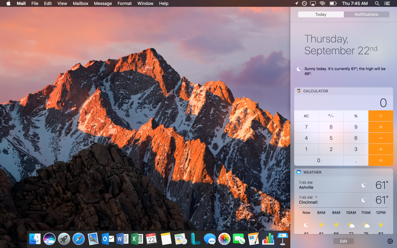
The previous version of Mac Os X had the notification center colored black, but the new in macOS is white!
- Anyone that knows how to change it back to the old color?
- Anyone know why they changed it?