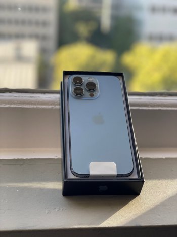
Now that it is day 2, who of those who got the Sierra blue, love it, or was int not quiet what you thought? Personally for me I like it but seems to have a purplish hue, so still on the fence. Happy to hear other thoughts! And pics are aways welcome, especially in cases.
Got a tip for us?
Let us know
Become a MacRumors Supporter for $50/year with no ads, ability to filter front page stories, and private forums.
iPhone 12 Pro Max Now that you've had the "blue", thoughts, regrets? (13 Pro and Pro Max)
- Thread starter kp98077
- Start date
- Sort by reaction score
You are using an out of date browser. It may not display this or other websites correctly.
You should upgrade or use an alternative browser.
You should upgrade or use an alternative browser.
not quite what I thought it would be tbh. But I’m still going to keep it because blue is my fav. Color. I got bored of graphite/space gray/etc.
yeah I hear ya, same, got bored of the usual grays, whites, etc...not quite what I thought it would be tbh. But I’m still going to keep it because blue is my fav. Color. I got bored of graphite/space gray/etc.
Honestly, it’s a nice colour.
Graphite is nice, but I had a Space Gray XS and I fancied something different. Silver looks a bit dull, I was hoping for a darker silver as the rear of it looks white. Gold is nice, but a bit too blingy.
So yeah, Sierra Blue was the option I went for.
That said, I would have loved to see a piano black version or the green from the 11 Pro.
I dont understand how the most expensive model has the worst colors. And that fingerprint magnet band...unacceptable.
well its not a fingerprint magnet at all actually IMO... they all are..I dont understand how the most expensive model has the worst colors. And that fingerprint magnet band...unacceptable.
I have zero regrets getting the Sierra blue. It looks great.
doneYou didn't put an option for I got it but I'm exchanging or wish i got another color
meaning you don't like to cover it up?I prefer the blue on my iP 12 Pro, but will survive with an appropriate case.
I like it but in person it is not nearly as blue as I hoped it would be. I think it needed to be just a bit darker. I am definitely keeping just wish it stood out more like it does in advertising.
No, rather my dark blue vaja case will hide the color nicely.
meaning you don't like to cover it up?
haha, why hiding tho?No, rather my dark blue vaja case will hide the color nicely.
Like many of their colors the lighting matters a lot - inside with warm lighting the Sierra Blue does trend more towards a steely gray, but outside in sunlight it can really pop! The sides also aren't as fingerprint-magnet-y as I thought they might be, I heard the blue this year has the same kind of special treatment as the gold last year on the side rails.I like it but in person it is not nearly as blue as I hoped it would be. I think it needed to be just a bit darker. I am definitely keeping just wish it stood out more like it does in advertising.
Have it. Switching to gold. Its not bad. But not out of this world. Bring matte black or bronze then yeah
Of the 4 choices, I like blue the best, but they were all boring. I like bright colors - give me just ONE vibrant choice - yellow, purple, teal. This color like the other choices is sort of "I'm an office worker" boring. I'm tired of silver/gray/black electronics. I'll add stickers to it or put a case on it. I love the 120 HZ so I'd certainly rather have the Pro in boring colors than the regular in a brighter color.
Interesting. Do you have a source for this?I heard the blue this year has the same kind of special treatment as the gold last year on the side rails.
I’m not doubting you just kinda curious about it. Thanks.
I like it but would probably order the graphite if I could do it over. I don’t dislike it enough though to return it.
Register on MacRumors! This sidebar will go away, and you'll see fewer ads.


