Hey everyone, I'm new to using Numbers and spreadsheet things, so I was wondering if you could help me with making a chart.
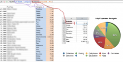
I have a spreadsheet with several lines of expense data, where each line item falls into one of many expense categories.
I would like to create a pie chart by expense type (ie, Toiletries, Dining, Cellphone, etc), but Numbers wants to treat each line item as a separate expense, even though many of them share the same name.
[Please see the attached image for my example]
Numbers makes the pie chart but puts every individual expense into a separate slice, so I end up getting multiple pie slices that all say "Dining" and so forth. I really just want one pie slice for Dining, one for Cellphone, etc.
Is there a way to combine pie slices or categories? Or is there a better way to accomplish this?
Thanks very much in advance")
Edit: I realized just now that someone else in another thread is asking how to do this same task, except in Excel. Since this thread is asking how to do it in Numbers, please keep this thread open.
I have a spreadsheet with several lines of expense data, where each line item falls into one of many expense categories.
I would like to create a pie chart by expense type (ie, Toiletries, Dining, Cellphone, etc), but Numbers wants to treat each line item as a separate expense, even though many of them share the same name.
[Please see the attached image for my example]
Numbers makes the pie chart but puts every individual expense into a separate slice, so I end up getting multiple pie slices that all say "Dining" and so forth. I really just want one pie slice for Dining, one for Cellphone, etc.
Is there a way to combine pie slices or categories? Or is there a better way to accomplish this?
Thanks very much in advance
Edit: I realized just now that someone else in another thread is asking how to do this same task, except in Excel. Since this thread is asking how to do it in Numbers, please keep this thread open.