Become a MacRumors Supporter for $50/year with no ads, ability to filter front page stories, and private forums.

silvetti

macrumors 6502a
Original poster
Nov 24, 2011
952
376
Poland
Hi guys,

I'm having some issues with graphs on Numbers for iOS... Maybe you can help...

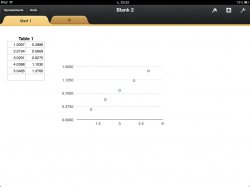
I have a table with values and I draw a scatter graph from them but I can't seem to get the table values on the x and y (to actually show the values, not just place the dot).

If you see on the screenshot I have 1.5, 3, 4.5 etc instead of the actual values.

Any clue how to resolve this?
ImageUploadedByTapatalk1370036333.678767.jpg
 
I have a table with values and I draw a scatter graph from them but I can't seem to get the table values on the x and y (to actually show the values, not just place the dot).

If you see on the screenshot I have 1.5, 3, 4.5 etc instead of the actual values.

I've never seen this type of graph (in any graphing application) do anything differently than what you're seeing. The x- and y-axis ticks and/or grids are always evenly spaced, and labelled like you see, rather than labelled with your data.


One really good reason for this will be clear the first time you try to plot hundreds or thousands of data points. ;)


Regards,
Tom

Thanks for your reply.

Maybe you are right :)

Another question if I may, what about line of best fit? Connecting first point directly to last one? Is it possible or would I have to do it by hand?
 
Thanks for your reply.

Maybe you are right :)

Another question if I may, what about line of best fit? Connecting first point directly to last one? Is it possible or would I have to do it by hand?
No, TJ61 is in error. What you have there is a standard scatter graph with one independent variable and one dependent variable. Your data appear to be evenly-spaced and straightline, but this is not required. As a general proposition, connecting the first point to the last point is a misrepresentation of your data. If you are doing this for a class, then your professor should debit your grade for this practice. Numbers has a "trendline" option for scatter graphs. This is what you need. These options are reasonably easy to find in the OS X version of Numbers. Unfortunately, Numbers is crashing on both of my iPads.
 
No, TJ61 is in error. What you have there is a standard scatter graph...

:confused: Are you confusing a scatter graph with one of the other graph types?

Here's an example (from Apple Support) of a scatter graph.

S4205_ScttrSharedXN.png


It's very much like a scatter graph in many other applications, in which the axis labels are independent of any particular data pair being plotted. Again, if you imagine a scatter graph containing hundreds or thousands of data points, it would not be possible for each to get it's own axis label.

Regards,
Tom
 
Last edited:
Register on MacRumors! This sidebar will go away, and you'll see fewer ads.