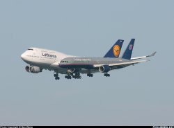
According to the CAA these two planes were at least 2.5 miles apart.
The DHL plane appears to be smaller, so its hard to believe its so much closer as that should make it appear larger than the other one.
Its amazing the tricks the eye can play on us. Maybe the other plane is MUCH bigger than the DHL one.
Full story...
The DHL plane appears to be smaller, so its hard to believe its so much closer as that should make it appear larger than the other one.
Its amazing the tricks the eye can play on us. Maybe the other plane is MUCH bigger than the DHL one.
Full story...
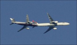
") ), It seems they are very close together. But look at the engines. I took it into photoshop and small plane needed to be scaled 135% to make it the same size.
), It seems they are very close together. But look at the engines. I took it into photoshop and small plane needed to be scaled 135% to make it the same size.