Got a tip for us?
Let us know
Become a MacRumors Supporter for $50/year with no ads, ability to filter front page stories, and private forums.
Oh the horror, my university's new website theme
- Thread starter xUKHCx
- Start date
- Sort by reaction score
You are using an out of date browser. It may not display this or other websites correctly.
You should upgrade or use an alternative browser.
You should upgrade or use an alternative browser.
pfft, that's no good, they forgot that when using every colour in the swatch their also suppose to use every FONT as well 
pfft, that's no good, they forgot that when using every colour in the swatch their also suppose to use every FONT as well
Don't forget an animated GIF or two
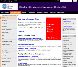
IT gets worse, having a look through the pages the tabs at the top change colour as well. If you want to have a nose around click here. The main page isn't too bad, which also highlights another problem with the website because just by looking at the two pages you wouldn't think they were the same University (apart from the logo).
I've already complained to them about the changes.
I've already complained to them about the changes.
It's not that bad, but I definitely agree with you as far as the colors are concerned. I like the black, orange, and light grey they having going on, but the blues in the links just make my eyes hurt.
I've already complained to them about the changes.
Rightfully so, but I think I'd find this conversation to be quite amusing.
"I'm not quite amused by these... changing tab colours!"
Of course, I'm quite certain you outlined your concerns in a more eloquent way, but the perceived possibility of such a conversation is amusing to me. And they could at least have the decency of integrating the logo into the header in a more subtle way. That white is just jarring.The layout isn't even that bad I get the idea I could find what I was looking for. But the colors make it clear taste is not subjective.
You think yours is bad, take a gander at this: http://www.ccsf.edu - try finding anything! Go ahead, I dare you - it's like a home page on mescaline. CCSF is where I do studio ceramics work, and using their Web page it's a miracle anyone ever gets correctly registered.
You think yours is bad, take a gander at this: http://www.ccsf.edu - try finding anything! Go ahead, I dare you - it's like a home page on mescaline. CCSF is where I do studio ceramics work, and using their Web page it's a miracle anyone ever gets correctly registered.
Ow! I got a headache after spending 10 seconds there.
Its just like every one public service website. Crap. Have you ever been to your local city's or states webiste, they suck, the color choices are bad, they have no navigation system known to man.
The only thing that public service websites are good for are web development classes. It makes it really easy, you can refer students to one URL and point every single thing you should't do.
Our loss, and even more their's as they lose cusomers/ visiters
The only thing that public service websites are good for are web development classes. It makes it really easy, you can refer students to one URL and point every single thing you should't do.
Our loss, and even more their's as they lose cusomers/ visiters
Yes, I have to agree.
This site has been tarred with the ugly brush, but I think the designers have made a reasonable compromise between Function and Aesthetics.
If the logo had been better integrated onto the header, which could have easily been accomplished by removing the white bg and using white text, and the link colour matched the tab colour of their respective pages I believe the thing would look a lot better.
I admit to using ranges of colours to identify different areas in web-sites on occasion myself, as I have found it comforting to those who are new to the internet.
Quite frankly, I hope you guys can find something better to whinge about. I'm getting bored.
You think yours is bad, take a gander at this: http://www.ccsf.edu - try finding anything! Go ahead, I dare you - it's like a home page on mescaline. CCSF is where I do studio ceramics work, and using their Web page it's a miracle anyone ever gets correctly registered.
Yikes! that brought back memories of my first time web-sufing in the 90's.
It's like that giant RED button one isn't supposed to pressSC68Cal said:That giant red square "Things not going right?"......... it's so...........distracting.....I.......can't.......look...........away.......
Yikes! that brought back memories of my first time web-sufing in the 90's.
It's like that giant RED button one isn't supposed to press
Wait, that one? Oops.
Though my question is: Does it link to a Help Desk or mental hospital?That giant red square "Things not going right?"......... it's so...........distracting.....I.......can't.......look...........away.......
Register on MacRumors! This sidebar will go away, and you'll see fewer ads.