Become a MacRumors Supporter for $50/year with no ads, ability to filter front page stories, and private forums.

tkermit

macrumors 68040
Original poster
Feb 20, 2004
3,649
3,129
What do you think? How much of an influence will the recent iTunes design changes have on the direction of the GUI on OS X 10.7?

I actually wouldn't be surprised if they instead re-imagined the GUI from the ground up, but if that shouldn't happen and they're going for more of an incremental improvement, then it's not unthinkable that they're using iTunes as a trial balloon again, to get some reactions to some of the interface changes. After all, the "source list", Coverflow, metal windows etc. were all pioneered on iTunes before they appeared in other OS X apps, if I remember correctly.

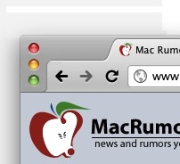
For example, I could imagine Apple applying the vertical window buttons to other applications where the title bar is not strictly necessary and where the user would profit from a little more efficient handling of space. Tabs on top will probably return in some way in Safari, which could be intelligently combined with a vertical window button layout. Maybe somewhat like the current version of Chrome ?!


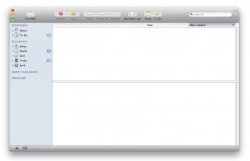
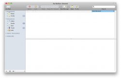
This is what Mail might look like (next to what it looks like currently) ;):
 

Attachments

  • mailmockup_jpg.jpg
    mailmockup_jpg.jpg
    76.8 KB · Views: 246
  • mailsl_jpg.jpg
    mailsl_jpg.jpg
    75.5 KB · Views: 166
  • chrome.jpg
    chrome.jpg
    13 KB · Views: 651
I believed the Source sidebar was an attribute of Finder first but upon further research I found it didn't arrive in the Finder until Panther (2003). iTunes 1 had it first in 2001, so it seems iTunes has been Apple's OS X UI testbed since it's inception.
 
On second thought, the footer bar might be a bad idea in Mail.app, because of the amount of space you lose for displaying the contents of mail messages
 
I'm not sure...they may have just did that to integrate it more with the mini player.
I think the vertical ones on most apps take up toomuch space. it looks like the iTunes 10 icons are a bit smaller/resized so if theyre resized it might work...
 
The vertical stoplights, and thus lack of a title bar won't happen.

It is a good idea in iTunes because all the title bar showed was "iTunes". It always stayed the same. In Finder, in Mail, the contents change depending on what's showing on the screen.
 
It is a good idea in iTunes because all the title bar showed was "iTunes". It always stayed the same. [...] in Mail, the contents change depending on what's showing on the screen.

That's true, and I'm not sure myself whether it would be a good idea in an application like Mail.

But, unless I'm missing something, it's mostly redundant content that's shown in Mail.app's title bar, isn't it? It displays what folder you're in, which should be obvious just by looking at the source list.
That leaves the message count, which could just as well be displayed in the footer bar, should they choose to implement that - like in iTunes.

I agree that it wouldn't make sense for the Finder at all, and you couldn't really save any space there either.
 
I wouldn't be very happy if the icons for minimize/maximize were to be like that.. because we are used to having them in the current position, that imo would not be a wise change, because it would have to mean all previous OSX users would have to get used to this new method :p.. I find that the itunes one will cause some confusion..

I would however like to see a theme similar to the one on the ipad, I think it looks quite nice..
 
I sure hope not. Apple has already violated some of its key design principles in iTunes. I wish those will never see the light of day in OS X 10.7.
 
I sure hope not. Apple has already violated some of its key design principles in iTunes. I wish it will never see the light of day in OS X 10.7.

Well, they apparently thought these folder icons were a good idea, so I wouldn't put anything past them. ;)
 

Attachments

  • shot.png
    shot.png
    14.4 KB · Views: 584
Yeah I definitely hope they don't use the current iTunes look. Don't like it, it needs more colour for those who don't have album covers constantly everywhere.

*hopes Steve Jobs will read this and consider it :p *
 
Nope. I really don't understand why Apple even allows the iTunes developers to ignore the UI design guidelines so much and with such poor alternative design choices too.
 
Register on MacRumors! This sidebar will go away, and you'll see fewer ads.