Got a tip for us?
Let us know
Become a MacRumors Supporter for $50/year with no ads, ability to filter front page stories, and private forums.
Permanent or iOS 10 glitch? (Photo Included)
- Thread starter Jasmynp
- Start date
- Sort by reaction score
You are using an out of date browser. It may not display this or other websites correctly.
You should upgrade or use an alternative browser.
You should upgrade or use an alternative browser.


It's a feature, not a bug.
EDIT: Read from https://forums.macrumors.com/threads/any-issues-with-ios-10-on-first-ipad-air.1995652/#post-23455420 onwards
EDIT: Read from https://forums.macrumors.com/threads/any-issues-with-ios-10-on-first-ipad-air.1995652/#post-23455420 onwards
It's a feature, not a bug.
EDIT: Read from https://forums.macrumors.com/threads/any-issues-with-ios-10-on-first-ipad-air.1995652/#post-23455420 onwards
Thanks!
To be fair, it can look a bit odd. I did some googling and found this website (it's actually a pretty good summary of iOS 10 features in general):
http://www.iphonehacks.com/2016/09/ios-10-features-new-hidden.html

So apparently the right column is meant to show your currently playing music.
http://www.iphonehacks.com/2016/09/ios-10-features-new-hidden.html
So apparently the right column is meant to show your currently playing music.
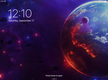
I know it's just one persons opinion but I DO NOT LIKE the off centered time on the lock screen. It just looks "crooked" to me. I just want to straighten it up like a picture.
Same here. I think it should be centered if you've got nothing to there, then switch to off center if you've got notifications or music playing.
Am I the only one who actually likes it better this way? I can't even explain why I like it better, it just looks right to me.
I love it! Brings more attention to my wallpaper too.
It's looks modern
It's looks modern
To be fair, it can look a bit odd. I did some googling and found this website (it's actually a pretty good summary of iOS 10 features in general):
http://www.iphonehacks.com/2016/09/ios-10-features-new-hidden.html
So apparently the right column is meant to show your currently playing music.
So strange, especially given how infrequently I listen to music on iPad. Compared to iPod, iPhone, Mac... it's almost certainly my least-used music player.
I spend little time staring at the lock screen so it is a non issue to me.

Where did you get that wallpaper?It's kinda funny that this is being mistaken for a glitch. I like it though. Something about it just makes the lock screen look more elegant to me.
It's funny. There are threads and complaints on how much wasted space there are in iOS 10 but when there's an example of efficient use of space (clock and notifications on the left. Media controls on the right vs. jamming everything dead centre on a landscape ipad previously) there are people who don't like that too.
To be clear I'm neither defending the old or new design, nor saying people can't complain about either design. Its just the perfect illustration of "damned if you do, damned if got don't". It's simply not possible to make everyone happy.
To be clear I'm neither defending the old or new design, nor saying people can't complain about either design. Its just the perfect illustration of "damned if you do, damned if got don't". It's simply not possible to make everyone happy.
Register on MacRumors! This sidebar will go away, and you'll see fewer ads.