Become a MacRumors Supporter for $50/year with no ads, ability to filter front page stories, and private forums.

geekindisguise

macrumors 6502
Original poster
Jul 22, 2008
297
0
Oklahoma
Ok, my current site design is not so great, so I want to change it. I think I have a good idea for one, but I need advice.
Right now I have the Intro page where you can go to all three of the pages.
http://jakes.is-a-geek.com/users/Jakestech/
Its the only part that I have made a webpage yet. Now I am working on designing the other pages.
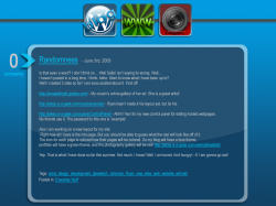
So far I have made my Blog page.

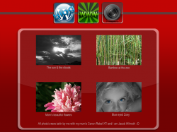
All the pages color themes are based off their icons. So the blog is Blue, the portfolio (WWW icon) is green, and the photo gallery will be red.

What do you think? :rolleyes:
 

Attachments

  • blog_page.png
    blog_page.png
    313.5 KB · Views: 110
... the portfolio (WWW icon) is green...

What do you think? :rolleyes:


- I clicked on the link before reading the full text and this is what I understood from the [maybe a bit too] large icons at the top. You link to a:

- Blog = obvious
- www = huh? the web as a whole.. the introduction page.. ??
- photo gallery = also obvious

- That 'WWW' icon is way too obscure.. in your own description you had to use parenthesis to let us know what the WWW was for. Every website begins with WWW.. soo I don't think you are offering any clues as to why someone should click that link.. i would suggest finding alternative imagery or type to help steer us in that links direction.

- hope that helps!

*last side note, just previewed this post and macrumors is rendering the www as a website = my point exactly... :D

Yeah I know, that icon took me forever to think of something good to represent a web design portfolio. What would be better? I was thinking of just a folder/portfolio sort of thing, but .... idk.
 
The other pages

I have created mockups of the other pages. And here they are. But I am still trying to think of something better for the portfolio icon. I don't want to just write web design but if I can't think of a better representation, I just might have to. :(
 

Attachments

  • photography_page.png
    photography_page.png
    534.7 KB · Views: 68
  • portfolio_page.png
    portfolio_page.png
    350.3 KB · Views: 70
This is just an idea:
if you want to incorporate the page color from the icon , why don't just use part of the page with that color ( eg just a horizontal box running 100%width), it'll look nicer and more distinctive.. Also try to use less color to make this concept stand outs.
At the moment the background color look too overwhelming ( but that's just me ) All the best :D
 
Hmm. Thanks

This is just an idea:
if you want to incorporate the page color from the icon , why don't just use part of the page with that color ( eg just a horizontal box running 100%width), it'll look nicer and more distinctive.. Also try to use less color to make this concept stand outs.
At the moment the background color look too overwhelming ( but that's just me ) All the best :D

Hm. I could make just the Box with the content be colored. And have all the backgrounds of all the pages the same color. Such as a light gray or something. I will have to find one that works.
 
Register on MacRumors! This sidebar will go away, and you'll see fewer ads.