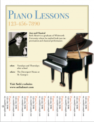
The templates in Pages '08 are great for me, but once I have added my own info, I feel like it doesn't look as good as the original template.
Can you give me suggestions to "fix" my design and make it look a bit more professional? Thanks
Brief background for those who care:
I am a musician just starting out as a self-employed professional. In addition to gigging, I am teaching lessons at various locations. One location is a private school where I need to advertise to the high school students via a poster or flyer or something. I figured this poster template would work great and be easy and cheap...
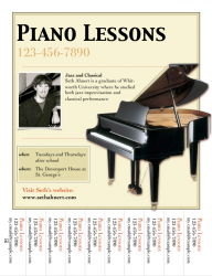
")