Become a MacRumors Supporter for $50/year with no ads, ability to filter front page stories, and private forums.

[READ BELOW FIRST]Which iPhone UI style would you be most tempted to download?

  • A Metalic / Matte-Black / Dark UI

    Votes: 49 43.0%
  • The normal iPhone UI

    Votes: 65 57.0%

  • Total voters
    114

HyperSnake

macrumors member
Original poster
Jan 5, 2009
74
0
Switzerland
Hello Everybody,

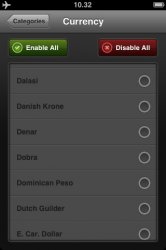
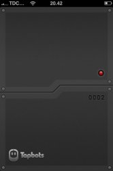
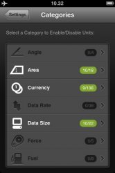
I'm currently creating an application in which the user can store all sorts of passwords, credit card information, usernames etc. I do not know, however, which UI style I should use: A metalic/matte-black/dark UI (like in the Convertbot and Weightbot applications) or the standard iPhone UI. Time or work required does not matter! All I'm asking is which UI would YOU be most tempted to download?

I've enclosed a couple of screenshots from the Convertbot app which shows the metalic/matte-black/dark UI I'm describing, and then just one screenshot showing the normal UI(which I assume you are rather familiar with anyway!).

Yours,
BEN.
 

Attachments

  • photo.jpg
    photo.jpg
    42.5 KB · Views: 138
  • photo 2.jpg
    photo 2.jpg
    34.3 KB · Views: 111
  • photo (2).jpg
    photo (2).jpg
    26.3 KB · Views: 105
  • photo (1).jpg
    photo (1).jpg
    19.6 KB · Views: 93
  • photo (3).jpg
    photo (3).jpg
    29.7 KB · Views: 96
I like the dark UI myself. I hope Apple changes the iPhone UI soon. It's starting to look dated to me.

On a side note... I really hope Apple re-designs the UI in Snow Leopard too.
 
I have to say it depends on what your app does. I like Converbot, but I use it only in short bursts. Dark background/light text combination is "cool," but if I have to look at it for too long, my eyes start feeling strained and I start feeling depressed. For apps that I need to interact extensively with, like lists, task management, notes, etc, I like dark text on light background. Of course, others have the opposite preference, so it's best if you can make both themes and let the user choose! ;)
 
I like the dark UI myself. I hope Apple changes the iPhone UI soon. It's starting to look dated to me.

On a side note... I really hope Apple re-designs the UI in Snow Leopard too.

What was the new SL theme called again? Like slate or something?

I could go for some of that in the iPhone.
 
I find it hard to believe that 14 votes for the standard UI while only 10 vote for the "sleek" one considering weightbot and convertbot are top sellers based on the look alone with near no functionality.
 
I would prefer the normal UI layout until I was familiar with the app then I would like the ability to change UI to the prefered color scheme of my choice, in this case black/ gray.
 
I prefer apps to have the standard UI - Just because I like consistency.
But I think I prefer the darker grey/black look.

You know? Lol
 
I prefer apps to have the standard UI - Just because I like consistency.
But I think I prefer the darker grey/black look.
Agreed. It's a "better idea" to go with the standard UI, but I think it looks a bit dated... apps like Convertbot are SO much better looking. I usually end up preferring apps with custom UI elements (Convertbot, Groceries, Movies Now!, etc.) — as long as they don't stray too far.
 
When designing iPhone's UI's I try to reflect what the application does. For example, a password app or safe application should portray some sort of metallic, lock-like design. A tasks application would have a paper, sketchy design. Of course you can also use the basic iPhone elements, but this makes the app harder to recognize.

The UI can also help with other branding for your application. For example, Jabeh's UI looks very similar to it's website (http://jabeh.org). The UI uses dark reds, gold woods, and purple stones which symbolize the Japanese origin of the game and give you the feel of playing on a real board.

For a password application I would highly recommend going for a light metallic UI with fake high-tech locks, blue and silver buttons, etc. I attached some screenshots of some UI's I've made. But please, don't steal any elements from the images, they're for inspiration, not ripping. More on my site, http://graphicpeel.com

Good luck!

jabeh.png
irag
 
I can very clearly tell what the app is and does that uses the standard UI. From the pics of the other UI, I'm not so sure. My first impression has to do with an iPod click wheel, then I wonder what the icons are and do and am left confused. The other sceen shots point to it having somthing to do with foreign currency. But I have no idea how it might work.

I don't think you want users to have to work to figure out how to use your app.
 
Thank you everybody for your inputs. I think I'll go with a custom look, but not an an all dark look. I'll have both gold(symbolizing luxury), chrome/metallic(symbolizing security) and matte-balck/dark(to match up the two others)
 
My ideal UI would be where I would have the option to switch between the two in the Settings menu. The black would be great for concerts, movies, nighttime, etc, and the normal UI is great for daytime.
 
My ideal UI would be where I would have the option to switch between the two in the Settings menu. The black would be great for concerts, movies, nighttime, etc, and the normal UI is great for daytime.

I'll look into it but I'm afraid I'd be spending wAy too much work for myself by doing it
 
I'll look into it but I'm afraid I'd be spending wAy too much work for myself by doing it

I just went back and read your original post. I had originally thought this was simply a suggestion for Apple, for OS 3.0. Now, that I see it is for an App that you are creating to store pswds, I would definitely want the black. Whichever version is going to make it more difficult for people standing around me to read what is on the screen. The contrast between the background and text should be minimized. Example: Gray text on black background, or gray on white, or back on gray, and so forth. Reducing contrast makes it more difficult for others to read. But then again, maybe most people aren't worried about that and want something that they can read as easily as possible, such as white text on black background or vice versa. Good luck! Currently, I use an App called Safe Note. I like it a lot, but it does not do everything that your App claims it will do.
 
Register on MacRumors! This sidebar will go away, and you'll see fewer ads.