Hi guys,
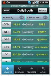
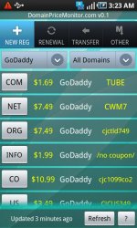
I am a new member here and I need your advice... I am porting my Android app to the iPhone and I have a dilemma on how to layout UI elements. Frankly, I am quite happy with how it has been laid out in Android app (please see the screenshots attached). It is simple to code, functional, and looks good enough for me.
However, I need your advice before I run myself into some troubles like Apple not approving my app for violating their UI guideliness or something like that. I do not think it will violate, but still want to hear your opinion.
So here are my questions:
1) Tabs on top - I know I cannot use standard iPhone UITabBar, so I will do some custom image-based tabs and place them at the top like in Android. Will apple ban my app just for the "fake tabs" at the top?
2) Is it possible that iOS control would automatically render for me the smooth gradient transparency change on the scrolling edge - see the Details screen at the bottom, the "scrolling edge" is a "border line" between "Back" button panel and main part of the screen. In Android, that effect is provided for you automatically by standard system controls. Could you please give me some tips as how to achieve that effect on the iPhone?
3) If I will NOT use UINavigationBar at all, but rather use that same "Back" button at the bottom of 2-nd screen - will that be too much annoying from the users prospective?
P.S. I've red some discussions as to what is better location for Tabs (Android has top tabs and iPhone has bottom tabs positions by default). I agree with both sides having their pros and cons. I would gladly put the standard iPhone tabs at the bottom, to make it more aligned with many iPhone apps, but that will likely cause so many other changes in the layout of my simple 2 screens, like
- where to place Company and Domain Type selectors? At the top? not really, will probably have to move them to the bottom too, and place them just above the bottom tabs. Well, for some reason when I try imagine that final layout, I do not like that idea
- also,"Refresh" button on the first screen would lose its consistency with "Back" button on the second screen. With the top tabs it all look simple and functional. Bottom tabs would present a new challenge to already "solved" app layout if I could say that ...
If you care to comment, I am glad to listen to your take on it!
Thanks, and
Happy Xcoding")
I am a new member here and I need your advice... I am porting my Android app to the iPhone and I have a dilemma on how to layout UI elements. Frankly, I am quite happy with how it has been laid out in Android app (please see the screenshots attached). It is simple to code, functional, and looks good enough for me.
However, I need your advice before I run myself into some troubles like Apple not approving my app for violating their UI guideliness or something like that. I do not think it will violate, but still want to hear your opinion.
So here are my questions:
1) Tabs on top - I know I cannot use standard iPhone UITabBar, so I will do some custom image-based tabs and place them at the top like in Android. Will apple ban my app just for the "fake tabs" at the top?
2) Is it possible that iOS control would automatically render for me the smooth gradient transparency change on the scrolling edge - see the Details screen at the bottom, the "scrolling edge" is a "border line" between "Back" button panel and main part of the screen. In Android, that effect is provided for you automatically by standard system controls. Could you please give me some tips as how to achieve that effect on the iPhone?
3) If I will NOT use UINavigationBar at all, but rather use that same "Back" button at the bottom of 2-nd screen - will that be too much annoying from the users prospective?
P.S. I've red some discussions as to what is better location for Tabs (Android has top tabs and iPhone has bottom tabs positions by default). I agree with both sides having their pros and cons. I would gladly put the standard iPhone tabs at the bottom, to make it more aligned with many iPhone apps, but that will likely cause so many other changes in the layout of my simple 2 screens, like
- where to place Company and Domain Type selectors? At the top? not really, will probably have to move them to the bottom too, and place them just above the bottom tabs. Well, for some reason when I try imagine that final layout, I do not like that idea
- also,"Refresh" button on the first screen would lose its consistency with "Back" button on the second screen. With the top tabs it all look simple and functional. Bottom tabs would present a new challenge to already "solved" app layout if I could say that ...
If you care to comment, I am glad to listen to your take on it!
Thanks, and
Happy Xcoding
Attachments

Last edited: