Become a MacRumors Supporter for $50/year with no ads, ability to filter front page stories, and private forums.

menziep

macrumors 6502a
Original poster
Jan 21, 2006
527
1
I was on Flickr and i came across this screenshot of 10.5.

It was posted on June 23rd 2006 and has 1 or 2 striking similarities to the Leopard Sneak Peek on Apples Website, Posted on August 7th 2006.

Safari
:) Find it Here

Note
*The Dashboard icon in Safari is the same.
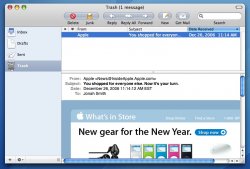
Mail
:) Find it Here

Note

*I love the theme!

Both are by the same user and both posted more than a month before WWDC 06

Please Post you Views/Comments on these screenshots
 
It could be shapeshifter

it could be a theme running on shapeshifter. whats up with the icons on the dock?
 
safari's theme looks ok, mail's theme looks really ugly. and I don't believe thats leopard
 
Why is Address Book's icon now black? Does it now only hold the details of ex-girlfriends, with a 5 star rating system (a la iTunes)? :p
 
safari's theme looks ok, mail's theme looks really ugly. and I don't believe thats leopard
I'm missing something here. Mail looks exactly like that already. Here's a snapshot, could someone please tell me the difference?

I just realized I installed UNO. But I seem to remember it looked like that before anyway.
 

Attachments

  • Mail.jpg
    Mail.jpg
    101.2 KB · Views: 119
I say fake...

why? Because it's pretty darn apparent that Mail is just skinned. And other various things have been edited.
 
I'm missing something here. Mail looks exactly like that already. Here's a snapshot, could someone please tell me the difference?

I just realized I installed UNO. But I seem to remember it looked like that before anyway.

The difference is that in the screenshot claiming to be leopard mail has a darker metal (iTunes) appearane and less radius on the rounded corners..

not a big change I know and personally I think it looks better as it is
 
I'm missing something here. Mail looks exactly like that already. Here's a snapshot, could someone please tell me the difference?

I just realized I installed UNO. But I seem to remember it looked like that before anyway.

its all about the color, and look at the color comparison between button and background, its totally weird to have buttons with slightly lighter color with same hue.
 
I say fake, since the iTunes logo is the green one and not the newer blue one, and I don't see Apple changing the color again. At least not for a while.

Also, not sure if this means anything, but that's a Core Duo, not a Core 2 Duo.
 
I say fake, since the iTunes logo is the green one and not the newer blue one, and I don't see Apple changing the color again. At least not for a while.

Also, not sure if this means anything, but that's a Core Duo, not a Core 2 Duo.

Look at the Teaser on Apples site, its green on there.

As for Core 2 Duo, it wasnt even announced and the Teams (Goes for iTunes and OS Devolvement as well) have very strict rules to stick to. Not allowing to share Beta's ect
 
Register on MacRumors! This sidebar will go away, and you'll see fewer ads.