scem0 said:
all I'd have to do to make the nav frame static is change it's position type in the CSS. I might do that.
scem0
edit - In fact I did that, just to see what it look like. I don't mind it that way, but I'll see what other say
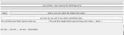
Changing the scrolling menu fixed an issue in Win IE 6 where the menu displayed to the far left after the rest of the page content. Now it's at the top of the left-hand column. And that's cool with me.
I'm not big on the dashed lines around the left and right navigation elements (although separating content in the main area with dashed lines is fine.). The high-contrast between the black background and the white dashes, coupled with the refresh rate (96hz on my computer) cause the dashes to look like they are moving in the preprimary when I read the text. It's like marching ants that only march with you're not looking at them. Very disturbing.

I'd hate to try it at a lower refresh rate.
Anyway, I'd change them to the elegant white border of the main content, both for the reason stated above and for consistencys sake. As I've stated on these forums before, I am a big proponent of monochrome websites, and grayscale is my favorite scheme (perhaps it's my newspaper background).
One thing you've done that I applaud: Typically, when going for a grayscale site, people make the mistake of using true blacks and whites for backgrounds. They are boring and hard on the eyes. The background you've chosen is, for all practical purposes, black, yet it's so much better than if you'd actually used black. Good job!
In your news tables, you need to add html container elements around the "posted by: {username} on {date}" line. Right now it just floats in the body element. While you're at it, you may want to add a CSS class that gives it a bit of white space (gray space?) below each story unit. Right now they're too tight.
There's one other issue I have; You're current navigation isn't long enough to justify a column in and of itself. If you scroll more than a few lines, you're left with nothing more than blank space in the right hand column. (And I could argue that as a right-reading culture, this blank space holds more importance and psychological weight to the average reader, but you'd probably stop reading this post in complete boredom.
I'm such a dork.)
I suggest a layout where:
a) You make the height of the navigation menu the same as the flag (title banner) and stretch the content <div> across both column one and two.
PHP:
----------  --------------------  ----------
|   menu |  |     flag         |  |   ads  |
|        |  |                  |  |        |
----------  --------------------  |        |
--------------------------------  |        |
|                              |  |        |
|         body                 |  |        |
|                              |  |        |
|                              |  |        |
|                              |  |        |
This has the advantage of putting the information in the left-most position. You could also try a horizontal menu as well. Check out
this link for a cool CSS menu (try example 4) that might do you well.
I say all of this because it looks as if you've given up on the floating menu. Reading the posts, I was under the impression that you still wanted the thing to float, but that I couldn't see it b/c I was on Win IE6, which doesn't do position: fixed. But upon further investigation in Opera (and noticing it didn't move) and then checking your CSS, I see you've used position:absolute for the menu. Until MS decides to implement the standard, I wouldn't design a page that so depends on this feature to plug unsightly white space. It becomes a design flaw for 70-80 percent of your visitors.
Since it looks like you're losing your instant access to navigation (or, if you choose position:fixed, at least for IE Win users) you might consider adding a "back to top" or some such link after each story. It's oldschool, but effective.
Ok, the person I've been waiting on has shown up, so I have to actually start working again. Hope some of this helps. Take it all with a grain of salt. Happy coding!
