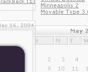
Well I've been at it again. This is the third major revision that I am doing to my site, and I really need some comments on the design and layout of what I have done. I know the code isn't completely valid and I will be fixing that soon, but I really need to know about the design before I get myself in too deep. Major concerns of mine are: is it too bright? is everything readable? does anything just not feel like it is in the right place? etc...
Thanks for your time, everyone.
LINK!
EDIT! the new design has been moved to the main site
[off-topic]
I know that I have been quite absent lately. With the birth of webkit message styles in Adium X, I became preoccupied with creating a couple message styles. Then the semester started coming to an end and I had a lot of homework to do, along with my actual job work. Then I promised myself that I wouldn't start redesigning my site until after finals week. Well I started at the beginning of finals week (last week) and I came out alright on my finals. So I'm sorry for my absence and lack of help around here. I will be attempting to make an effort to float around here more.