have you guys agree that Remote music app is much better UI than white/pink UI on iOS7 music
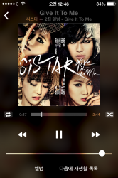
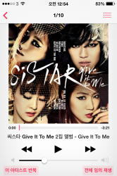
the transparency/blurry UI depends on album artwork it looks nicer
the transparency/blurry UI depends on album artwork it looks nicer
Attachments
Last edited:
") But you can't seriously tell me that it's easy for you to figure out the fact that the shuffle function in the following screenshot is enabled? (yes, really) Not that it is much easier in your own screenshot that you posted. To me that's just a mind-blowingly bad UX resulting from an apparent total disregard of the notion that form follow function, instead of the other way around.
But you can't seriously tell me that it's easy for you to figure out the fact that the shuffle function in the following screenshot is enabled? (yes, really) Not that it is much easier in your own screenshot that you posted. To me that's just a mind-blowingly bad UX resulting from an apparent total disregard of the notion that form follow function, instead of the other way around.