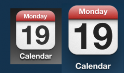
Looking at the icons on my iPhone 4S and iPad(3rd gen), I noticed that the drop shadow is more pronounced(text below the icon) on the iPhone, than it is on the iPad.
The OCD in me wishes that the icon text was the same as on the iPhone, as it pushes the text out more, especially on bright wallpapers.
Image: iPhone on the right, iPad on the left, shown 1:1.
The OCD in me wishes that the icon text was the same as on the iPhone, as it pushes the text out more, especially on bright wallpapers.
Image: iPhone on the right, iPad on the left, shown 1:1.
Attachments
Last edited: