I've never owned a MacBook before but I've been in the market for something that is fitting for graphic designers. I was excited when I heard about the new MacBook, it looks beautiful. I'm no genius with computer specs and I just need to know if anyone has used Photoshop, Illustrator, ect. with the new retina display? In terms of performance and display is it the same or better? Has anyone experienced any difficulties because it's not made for retina screens? Thanks!
Got a tip for us?
Let us know
Become a MacRumors Supporter for $50/year with no ads, ability to filter front page stories, and private forums.
Retina MacBook Pro & CS5?
- Thread starter Brittanydavie
- Start date
- Sort by reaction score
You are using an out of date browser. It may not display this or other websites correctly.
You should upgrade or use an alternative browser.
You should upgrade or use an alternative browser.
I use CS3 on a PC professionally and had a devil of a time making it work with Windows 7 64-bit. I'd be very concerned about having the retina display. It's hard enough to get the display of ANY computer to equal print output - color, brightness, saturation (especially), etc. It has to be set up so what you see on the screen is what is printed.
I, too, will be interested to hear how this works. Backlit colors (screen) are totally different than reflective (print) in many ways. I have a feeling this might not be in the best interest of pro photos or graphics folk who deal in print.
I, too, will be interested to hear how this works. Backlit colors (screen) are totally different than reflective (print) in many ways. I have a feeling this might not be in the best interest of pro photos or graphics folk who deal in print.
I use CS3 on a PC professionally and had a devil of a time making it work with Windows 7 64-bit. I'd be very concerned about having the retina display. It's hard enough to get the display of ANY computer to equal print output - color, brightness, saturation (especially), etc. It has to be set up so what you see on the screen is what is printed.
I, too, will be interested to hear how this works. Backlit colors (screen) are totally different than reflective (print) in many ways. I have a feeling this might not be in the best interest of pro photos or graphics folk who deal in print.
I don't think color is so much the concern, anyone working on a laptop already has to deal with that. The issue with the Retina display, for me at least, is how the apps I'm working in actually look. We've seen a few non-native apps like Chrome that look absolutely awful on the Retina display, for example.
Something like that is already being corrected and we know there's an optimized version of Photoshop on the way, but it's the rest of the Creative Suite and things like Maya that I'm worried about. I'd imagine the most recent versions will be updated, at least eventually, but if you're like one of many designers who's often working in software a version or two back you may be SOL.
It looks sort of MEH. Like I don't really even know how to explain it.. I think that things that aren't optimised for Retina look terrible even though they are probably better than they'd look on any other screen.. I'm sure that everything will get updated though.
Didn't Apple mention that photoshop will be getting an upgrade soon?
Didn't Apple mention that photoshop will be getting an upgrade soon?
Well it's definitely a deal breaker for me if the programs just look "meh"
I really want to buy something that is generally hassle-free and I get the sense that the retina MacBook Pro isn't in my case.
I really want to buy something that is generally hassle-free and I get the sense that the retina MacBook Pro isn't in my case.
Well it's definitely a deal breaker for me if the programs just look "meh"
I really want to buy something that is generally hassle-free and I get the sense that the retina MacBook Pro isn't in my case.
It looks "meh" because the apps haven't been updated for retina yet but Adobe has already announced that they're working on it. It will look amazing when they're updated, I promise.
It looks "meh" because the apps haven't been updated for retina yet but Adobe has already announced that they're working on it. It will look amazing when they're updated, I promise.
Only problem is using older versions of stuff and waiting who knows how long until most of all your apps are updated...
kinda sucks IMOIm using Photoshop and Premier CS6 on the RMBP and currently it looks ugly. Waiting for the updates that support Retina Screen. Final Cut X looks beautiful though.
Performance wise, its really really fast!! But that is to be expected when u have an SSD, Nvidia 650M, i7 Ivy, 8gb ram in this beast.
Performance wise, its really really fast!! But that is to be expected when u have an SSD, Nvidia 650M, i7 Ivy, 8gb ram in this beast.
It looks sort of MEH. Like I don't really even know how to explain it.. I think that things that aren't optimised for Retina look terrible even though they are probably better than they'd look on any other screen.. I'm sure that everything will get updated though.
Didn't Apple mention that photoshop will be getting an upgrade soon?
could you please screen capture how photoshop looks now and attach it in your next post ? Thanks
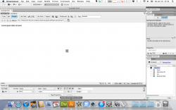
I can confirm that CS5 looks "meh" on the Retina. To me it's just as bad as the 2X mode on the iPad. I am attaching two screen shots from Dreamweaver CS5.5. The one named DW_Screen is the Retina version. The other screen grab(NR_DW_Screen) is from a non-retina MBP(high-res/AG). Depending on your screen size you might have to zoom into the image to see what I'm talking about. I confirmed the same fuzziness in Photoshop. Photos are scaled and therefore you aren't able to see it in it's native resolution within Photoshop.
It's kind of hard to look at. I just started a project in Dreamweaver and it's already annoying me after just a few minutes. I'll keep soldiering on to see if my eyes get use to it but so far I'm not liking it. In the screenshots, focus on the bottom of the image where the dock(retina resolution) is juxtaposed with the scaled Dreamweaver interface. Going from a supremely crisp image to something that is fuzzy is pretty hard on my eyes.
Oh well, that's the price of being an early adopter.
So if you need to use the Retina immediately for work, be warned. Apps that aren't native will be tough to work with if you're like me.
EDIT: Upon reviewing my post I realize that my screenshots are less than optimal to show you how bad non-retina apps are to use. My apologies. But I assure you Photoshop is very hard on the eyes until they update it. Hopefully you have Aperture which is retinized. Also, the pic on the left is the retina one.
UPDATE: After using Photoshop and Dreamweaver CS5 for a few days I want to change my opinion to "acceptable". The only thing that you suffer from when using CS5 on a Retina is the UI scaling. When you bump it up to 1680x1050 it is much better than the default setting. When you compare the image itself(the thing that matters most) on a Retina vs. a non-Retina, the image is far superior on the Retina. Now I'm just giving you my subjective opinion after do a side by side on both machines with the same images. I have been using the Retina the past couple of days and I like it a lot. The image and text (non CS5 UI) clarity is soooo nice. If you're on the fence because of UI issues you'll quickly forget it unless you are hell bent on staying on 1440x900. Since I prefer the high res version of the 15 I'm already used to 1680x1050 so it's fine with me. I'll come back with an update later.
Attachments
Last edited:
This is so frustrating. I wish they came out with the same computer, only with no retina screen. I hate that there's no telling when programs will be updated to use normally on the retina. That's great they're already talking about Photoshop's update and all but I use that the least out of the creative suite. I'll be more willing to buy when they start talking Illustrator and InDesign :/
I can confirm that CS5 looks "meh" on the Retina. To me it's just as bad as the 2X mode on the iPad. I am attaching two screen shots from Dreamweaver CS5.5. The one named DW_Screen is the Retina version. The other screen grab(NR_DW_Screen) is from a non-retina MBP(high-res/AG). Depending on your screen size you might have to zoom into the image to see what I'm talking about. I confirmed the same fuzziness in Photoshop. Photos are scaled and therefore you aren't able to see it in it's native resolution within Photoshop.
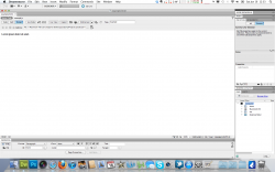
So I downloaded both images, and compared them in Photoshop. Do I correctly understand you to mean that non-retina optimized programs look "meh" in comparison to programs that are optimized, and that the problem is having both on screen at once and finding the difference jarring? Or do you mean that non-optimized programs are objectively "meh"?
When I increase the size of both images so that icons in the bottom toolbar are equal in size, they appear to be identical (looking at the "italics" icon, "Page Properties..." button, etc). I don't see any fuzziness in the retina screenshot that isn't there in the non-retina. Of course, the non-retina screenshot is from a 1680x1050 display, while the retina screenshot is effectively 1440x900, so if you make both full screenshots the same size (as opposed to matching the size of Dreamweaver UI elements), of course the non-retina looks sharper: the same number of effective pixels are in a smaller amount of space. That doesn't seem to be a problem in rendering on the retina screen though, the issue would be identical between 15.4" non-retina 1680x1050 and 1440x900 screens.
Is there something I'm missing? Or does the problem not really show up in screenshots, because it's an effect of the retina screen's 4:1 pixel swap making the Dreamweaver UI appear sharper, thus making its lower resolution more apparent than on a non-retina screen?
Anyway, thank you for posting the screenshots. I'm very interested in this issue, and seeing hard evidence is very helpful. If you have the time, could you post a similar pair of shots, but with the retina screen at an effective 1680x1050, so we could see how it looks when all UI elements are taking up the same amount of screen real estate? Thanks again.
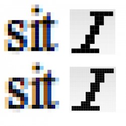
Too many words didn't read it all however have a look at the "written" text in the two images and you'll see a difference.
So I downloaded both images, and compared them in Photoshop. Do I correctly understand you to mean that non-retina optimized programs look "meh" in comparison to programs that are optimized, and that the problem is having both on screen at once and finding the difference jarring? Or do you mean that non-optimized programs are objectively "meh"?
When I increase the size of both images so that icons in the bottom toolbar are equal in size, they appear to be identical (looking at the "italics" icon, "Page Properties..." button, etc). I don't see any fuzziness in the retina screenshot that isn't there in the non-retina. Of course, the non-retina screenshot is from a 1680x1050 display, while the retina screenshot is effectively 1440x900, so if you make both full screenshots the same size (as opposed to matching the size of Dreamweaver UI elements), of course the non-retina looks sharper: the same number of effective pixels are in a smaller amount of space. That doesn't seem to be a problem in rendering on the retina screen though, the issue would be identical between 15.4" non-retina 1680x1050 and 1440x900 screens.
Is there something I'm missing? Or does the problem not really show up in screenshots, because it's an effect of the retina screen's 4:1 pixel swap making the Dreamweaver UI appear sharper, thus making its lower resolution more apparent than on a non-retina screen?
Anyway, thank you for posting the screenshots. I'm very interested in this issue, and seeing hard evidence is very helpful. If you have the time, could you post a similar pair of shots, but with the retina screen at an effective 1680x1050, so we could see how it looks when all UI elements are taking up the same amount of screen real estate? Thanks again.
Too many words didn't read it all however have a look at the "written" text in the two images and you'll see a difference.
They look identical if you make the text the same size. Any difference in sharpness in the screenshots seems to be because they are of a 1680x1050 non-retina screen and an effectively 1440x900 retina screen, so the non-retina has the text smaller on the screen, thus apparently sharper. Go to the pixel level and the letters are identical. That doesn't seem to indicate an issue with the retina screen.
There may well be a further issue where the sharper 4:1 pixel swap makes the flaws in the lower resolution text more apparent on the retina screen, but that isn't something that will show up in a screenshot.
EDIT: Added an image demonstrating what I mean. I took one word of text from each screenshot, as well as the "Italics" button. Correcting for the size difference between 1680x1050 and (effectively) 1440x900, they're the same.
Attachments
Last edited:
Something like that is already being corrected and we know there's an optimized version of Photoshop on the way, but it's the rest of the Creative Suite and things like Maya that I'm worried about. I'd imagine the most recent versions will be updated, at least eventually, but if you're like one of many designers who's often working in software a version or two back you may be SOL.
I am very curious about this too, but I am not too worried.
Have you checked out a new RMBP in scaled resolutions? Even at 1680X1050 I could not see any pixelation at normal distance. This means things like Maya will still look great, and the viewport won't be bogged down by trying to have the GPU render out more pixels than necessary. And it looks even better at 1920X1200 on the 15" screen. Again, could not see any pixelation on either of these at a normal distance.
Well it's definitely a deal breaker for me if the programs just look "meh"
I really want to buy something that is generally hassle-free and I get the sense that the retina MacBook Pro isn't in my case.
From what I have read, and from what I gathered from seeing one in the store, that is the case. I would go with the standard. It is still a great computer - better than last years (which was still a great computer) and you will not have the resolution issues to be concerned about. It will take time for software developers to update all of their software, and if you already own licenses for some last generation software, you will probably be forced to upgrade, which will be more money.
The standard 15" is a very solid choice IMO.
Here's a quote from a local newspaper article I read today.
"The Retina MacBook starts at $2,199, nearly three times as much as the average consumer spends on a laptop, but it isn't a bad price for the video editors, photographers and graphic designers who are the intended buyers."
Key word = graphic designers
Hmmm...I guess the only way to tell is to test it out myself!
I am very curious about this too, but I am not too worried.
Have you checked out a new RMBP in scaled resolutions? Even at 1680X1050 I could not see any pixelation at normal distance. This means things like Maya will still look great, and the viewport won't be bogged down by trying to have the GPU render out more pixels than necessary. And it looks even better at 1920X1200 on the 15" screen. Again, could not see any pixelation on either of these at a normal distance.
I actually played a bit with Photoshop and Illustrator on a MacBook Pro with Retina at the default resolution at the Apple Store on Friday and I came away impressed. Yes, there was a bit of fuzziness and pixelation in places but as a whole things looked much better than I expected them to in the non-optimized version. I'd also bet that you're right, they probably look fine at 1680x1050.
I'm curious how an app that may not be as well written to work at different resolutions may work (i.e. Maya) but I'm not nearly as concerned about the Creative Suite as I was before.
For me it's probably going to come down to whether I want to move everything over to a non-upgradable machine, as well as whether or not I want to move from two machines (currently on an iMac and a 13" MBP) to one that I hook up to an external display.
For me it's probably going to come down to whether I want to move everything over to a non-upgradable machine, as well as whether or not I want to move from two machines (currently on an iMac and a 13" MBP) to one that I hook up to an external display.
I do not really think about it as a non-upgradeable machine. If you bought the old design, what would you upgrade it to? Put in a small SSD for apps and OS? Well RMBP has larger SSD for everything.
Put in more RAM? Go ahead and do a BTO option for 16 GB. Those are really the only things. And if anything, the SSD already being there is going to do you good. The RAM at 8GB is already more than most people will need. And if you need more, the price Apple is charging for an 8-16 GB RAM upgrade is cheaper than other PC manufacturers:
http://img688.imageshack.us/img688/9332/ramupgradehpandapple.jpg
To me, it is not a non-upgradeable machine. It is a machine that already has all the upgrades you would need. And that is why Apple is calling it their best notebook ever. Because it comes with everything already.
Not to mention if you are doing intense work on it, the superior cooling system will help keep the components cooler, thus making your RMBP last longer.
Until Adobe's apps are updated for retina display, the MacBook's built in screen will actually be worse for content creation instead of better. The screen is 2880x1800 pixels but scales all content to behave as if the screen were 1440x900 ( the resolution of the legacy 15" MacBook Pro). That means that if you launched Photoshop on both the new model with retina display and the legacy model, then created a web banner document that was 728x90 pixels and 72dpi, the document would be the exact same physical size on both displays. But on the retina display, the image quality would be the equivalent of viewing the document at 200% scale; jaggy and pixelated.I've never owned a MacBook before but I've been in the market for something that is fitting for graphic designers. I was excited when I heard about the new MacBook, it looks beautiful. I'm no genius with computer specs and I just need to know if anyone has used Photoshop, Illustrator, ect. with the new retina display? In terms of performance and display is it the same or better? Has anyone experienced any difficulties because it's not made for retina screens? Thanks!
Once Photoshop is updated for the retina display, if it behaves like Final Cut Pro X then that same 728x90 pixel document will take up half as much screen space on the retina display, and be razor sharp with a 1:1 pixel match. At which point you could either choose to work at half the size that your banner would appear in a web browser, or pixel double your own document to 1,456x180, then save it at 50% scale when you're finished.
For the time being, you're better off running the Adobe apps on an external display, or not buying the retina display model at all.
I do not really think about it as a non-upgradeable machine. If you bought the old design, what would you upgrade it to? Put in a small SSD for apps and OS? Well RMBP has larger SSD for everything.
Put in more RAM? Go ahead and do a BTO option for 16 GB. Those are really the only things. And if anything, the SSD already being there is going to do you good. The RAM at 8GB is already more than most people will need. And if you need more, the price Apple is charging for an 8-16 GB RAM upgrade is cheaper than other PC manufacturers:
http://img688.imageshack.us/img688/9332/ramupgradehpandapple.jpg
To me, it is not a non-upgradeable machine. It is a machine that already has all the upgrades you would need. And that is why Apple is calling it their best notebook ever. Because it comes with everything already.
Not to mention if you are doing intense work on it, the superior cooling system will help keep the components cooler, thus making your RMBP last longer.
Rather than non-upgradeable a better term to use might be non-replaceable. I've changed out the battery and hard drive due to wear or failure in pretty much every machine I've had and that isn't possible with this one, and I can't say i'm hot on the idea of losing my machine for a few days for replacement (nor can I even afford to with work and school).
That's a personal choice though, I can certainly see the arguments for it as well.
Or you can just run it using 1680x1050 / 1920x1200
Until Adobe's apps are updated for retina display, the MacBook's built in screen will actually be worse for content creation instead of better. The screen is 2880x1800 pixels but scales all content to behave as if the screen were 1440x900 ( the resolution of the legacy 15" MacBook Pro). That means that if you launched Photoshop on both the new model with retina display and the legacy model, then created a web banner document that was 728x90 pixels and 72dpi, the document would be the exact same physical size on both displays. But on the retina display, the image quality would be the equivalent of viewing the document at 200% scale; jaggy and pixelated.
Once Photoshop is updated for the retina display, if it behaves like Final Cut Pro X then that same 728x90 pixel document will take up half as much screen space on the retina display, and be razor sharp with a 1:1 pixel match. At which point you could either choose to work at half the size that your banner would appear in a web browser, or pixel double your own document to 1,456x180, then save it at 50% scale when you're finished.
For the time being, you're better off running the Adobe apps on an external display, or not buying the retina display model at all.
No, because it doesn't actually run at those resolutions. It runs at the equivalent of those resolutions in terms of screen real estate, but documents in Adobe apps will still look jaggy and pixelated.Or you can just run it using 1680x1050 / 1920x1200
Register on MacRumors! This sidebar will go away, and you'll see fewer ads.