Hi
I'm more of a page visitor than writer, so I'm not going to mention css, etc. i visited with images on, so hopefully you've got alt text and sizes worked out. And in that vein...
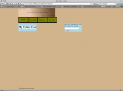
i like that the brown text-in-header-image melts (somewhat) into the page's brown bgrd. should the bgrd color be sampled from light side of image gradient or mid? i'd sample from the light side of mid, because light page backgrounds are usually better.
IME, the pale cornflower twitter boxes don't work with the olive main menus
I personally dislike text in images, but recognize that you wanted that font.
Biggest problem, IME:
The left column is huge, and stays huge at various browser window dims. worse, the right column disappears when window is narrower (i often run text editor at about 2/5 of display width, so browser tends to be roughly 1/2 display width). for whatever reason, a horiz scrollbar doesn't even appear to indicate page area exists off the right side of browser window. A reply below used the term "scale", which you would use when googling info. eg: Scale "CSS 2.1"
i personally dislike oversize logos/headers/filler, especially on any page except the "home index" page. nav menus should be designed with similar consideration.
i am using this site to display my twitter feed and my contact info and a place to host my little scripts and snippets so people can download
IME, then it's ok, even as it (except for the column waste). You're not worrying about eking out the tiniest .006% margin of visitor revenue. (besides, ebay and many news sites are frakkin messes, and they seem to do ok) (As exists now) your page is not even close to painful to visit.
")
As some suggest here and elsewhere, "analyze" pages on the web that you like. Find one with no (or inconsequential) scripts, wget a copy, then play around with layout, etc.
{quoting a bunch of "Jim Goldbloom" reply:}
Simple is good.
Actually, simple is
easier. Complex, dense, and good is
better.
Navigation should be intuitive
putting "intuitive" in quotes... then yes absolutely.
Consistency is key
something like that. on larger sites, giving a regional feel is a bit better. (there's a term for this ITRW, but the term slips my mind right now.)
Don't forget the content
absolutely. compared to a mess like ebay et al, I much prefer visiting someone's gnu ware page from 1997, that appears to be simply paragraphs of plain text (yet in my default font). but in all cases content is what brings me, keeps me, or doesn't. At worst, i can pull down View>Page Style> No Style. Or fall back to view-source (eg, view-source:google.co.il/) to see what's scruud up. When I bother to do that, content has
obviously won over truly miserable scripts, etc.
Develop for multiple browsers
This is less of a problem when you assume ie6 is dead (yay!)
you'll usually find browser differences when you're experimenting.
i'd dev in ff, check in opera (usually just fine), then check in ie7. adjust for ie7 by adding an {if ie7 }.. {endif} conditional around your final {link... css /} in your {head}... {/head} This seems most reliable, IME (limited experience, though)
http://www.google.com/search?q="if+ie7"+endif+Conditional+link+rel+CSS
...
unfortunately it's difficult to immediately see one's own work with a fresh eye.