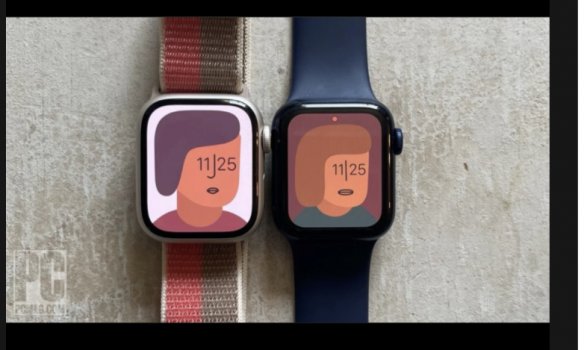
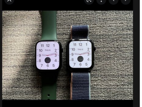
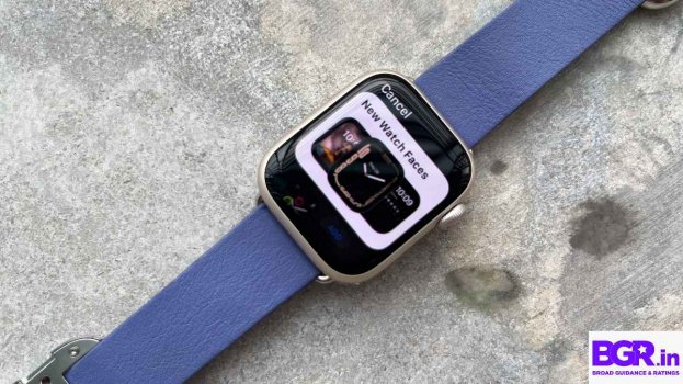
Not always but some angles and low brightness levels it seems more pink than I recall w my s4 or gf’s s6 in white text bubbles
Anyone else have this or notice this ? Maybe the previous was more yellow/green and didn’t know
I’m too observant with screens…
The intense off axis blue shift seems gone on the upside and it is brighter than s6 where it counts
The numeric passcode, columns for list of text messages in messages and settings seem much more neutral though where they had like a greenish hue glow on s4 and what I saw s6 and no grainy vertical banding on s7
this arstechnica photo with s7 on left seems a decent representation and some other media outlet review photos. Hard to capture it in a photo realistically without it looking really bad and not accurate to what the eye sees these professional ones ain’t bad
subtle in decent lighting or almost indiscernable but in dim lighting and brightness and off angle can become more obvious
Attachments
Last edited:


