Become a MacRumors Supporter for $50/year with no ads, ability to filter front page stories, and private forums.

MacRumors

macrumors bot
Original poster
Apr 12, 2001
67,619
38,026


Apple today updated its Shazam app for the Mac for the first time in two years, introducing Apple silicon support for M1 and M2 Macs and adding a refreshed icon that is in line with the look of macOS Monterey.
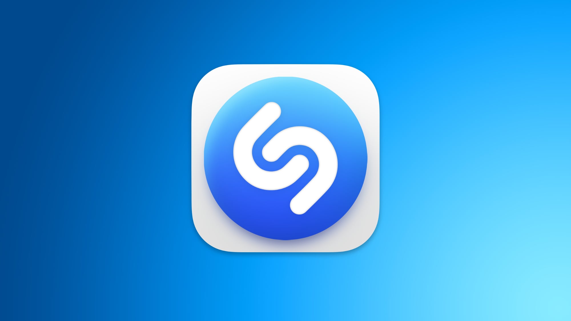
shazam-for-mac.jpg

The Shazam app for Mac is now using Apple's universal binary so it runs natively on both Intel Macs and those that have Apple-designed chips inside.

Apple finalized its purchase of Shazam back in 2018, but the Mac app has received few updates since then, making this the most notable update since the acquisition.

The Shazam app adds an icon to the Mac's menu bar that can be clicked to identify a song that is playing. The functionality is built into Siri so Mac users can access Shazam without having to install an app, but some may prefer an easy access menu bar app.

(Thanks, Aaron!)

Article Link: Shazam App for Mac Gains Apple Silicon Support, New Icon
 
I wonder if iOS 17 will change the look of the icons to match that style, or if it will remain unique to macOS?

It will be the 10th year since the iOS 7 redesign from 2013, so it would be fitting, but maybe they’d look too weird on a phone. I’m not sure everyone would like them.
 
I wonder if iOS 17 will change the look of the icons to match that style, or if it will remain unique to macOS?

It will be the 10th year since the iOS 7 redesign from 2013, so it would be fitting, but maybe they’d look too weird on a phone. I’m not sure everyone would like them.
If I may ask, what's the difference? They look very similar to me.
 
I wonder if iOS 17 will change the look of the icons to match that style, or if it will remain unique to macOS?

It will be the 10th year since the iOS 7 redesign from 2013, so it would be fitting, but maybe they’d look too weird on a phone. I’m not sure everyone would like them.
Doubt it. Everything is mostly flat, like signs, symbols, logos, brands, etc.

Lots of companies already started changing their branding to something more simple and flat.

Also wouldn’t look that nice with smaller Apple Watch icons.
 
All apps should adopt the new rounded corner icons. Amazed it took Apple this long. The current icon shape has been standard for two years now.
Not only should they be required to have the rounded corners, but they should also require an alternate icon for dark mode. It's annoying to have so many apps that dumbed down their identity to two shapes on a white square. Then add all of these white spaces on a dark mode that's meant to ease the eyes.. first world problem, but really gets to me from a ux perspective, no consistency.
 
  • Love
Reactions: vitordill
All apps should adopt the new rounded corner icons. Amazed it took Apple this long. The current icon shape has been standard for two years now.
In a few years we'll go back to using any shape we want for icons and everyone on Macrumors will hate them at first and then say they're better than before.

You can bet your life on that.
 
I wonder if iOS 17 will change the look of the icons to match that style, or if it will remain unique to macOS?

It will be the 10th year since the iOS 7 redesign from 2013, so it would be fitting, but maybe they’d look too weird on a phone. I’m not sure everyone would like them.
I hope Apple comes up with a different style for iOS icons that is similar but flatter. A lot of the new macOS icons don’t translate that well to smaller screens.
 
  • Like
Reactions: vitordill
what's an example of an app that doesn't have rounded corners?
This article and its comments are about Mac applications

There are many of those without Big Sur-ified icons:

Spotify
Firefox
VLC
LaunchBar
DaisyDisk
Acorn (image editor)

The last three are maybe not so well known but they are Mac-only so it’s really weird they still have old style icons
 
This article and its comments are about Mac applications

There are many of those without Big Sur-ified icons:

Spotify
Firefox
VLC
LaunchBar
DaisyDisk
Acorn (image editor)

The last three are maybe not so well known but they are Mac-only so it’s really weird they still have old style icons
so you're saying the old icon was just the blue dot without the white rounded background?
 
Parallels is the one that sticks out the worst like a sore thumb on my dock, and for such an Apple-centric company, it baffles me that they refuse to update their icon...
Check out this site: https://macosicons.com/
Lots of high quality replacement icons on there :)
You can apply them by Get Info'ing an app and dragging the downloaded .icns file onto its icon.
You have to redo it every time the app updates, but it's soooo worth it.
 
Last edited:
Register on MacRumors! This sidebar will go away, and you'll see fewer ads.