Here's two screenshots of my Desktop.
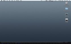
1) Leopard
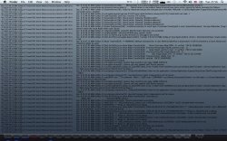
2) Snow Leopard
Is it just me, or is some of the icons such as Aperture, Nikon, Tweet, and Phone View in the Snow Leopard lighter vs the other icons in the Snow Leopard and all the icons in the Leopard screenshot?
I edited these in Snow Leopard and Leopard and it seems the icons done in SL are lighter than the ones in Leopard.
Am I seeing stuff or is it really lighter vs the others?
1) Leopard
2) Snow Leopard
Is it just me, or is some of the icons such as Aperture, Nikon, Tweet, and Phone View in the Snow Leopard lighter vs the other icons in the Snow Leopard and all the icons in the Leopard screenshot?
I edited these in Snow Leopard and Leopard and it seems the icons done in SL are lighter than the ones in Leopard.
Am I seeing stuff or is it really lighter vs the others?