One of the reasons I love apple so much is because they care not only about how functional and powerful their products are but also how user-friendly and intuitively they are designed. Every detail is well thought out. However, there are a few things that have always bothered me - not game changers in my iOS experience, but things that seem uncharacteristically clumsy or overlooked.
Music controls + rotation lock in the multitasking bar
When Apple introduced multitasking in iOS4, they got rid of the music controls that pop up when you double click the home button while the device is on (this still exists when you double click in the lock screen). Currently, to control your music and rotation lock, you must first double tap and then swipe right. To control volume or airplay, you double tap and then swipe twice. This is annoying and unnecessarily complicated.
For "simple" users (people who don't visit sites like Macrumors, your grandparents, etc.), this is hard to remember and unintuitive to use. I bet a lot of people don't even know that they can swipe the multitasking bar...twice.
For more adept users it's annoying, and you can't rely on muscle memory to control your music when you're not looking. I bet a lot of you have used the music controls on your lock screen so many times that you don't have to look to be able to press the correct buttons. And doing this every time you want to lock the rotation (especially if you frequently use your iOS device lying down) becomes like chinese water torture - small droplets that eventually bore their way through your mind.
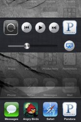
Solution: Have a secondary dock that pops up when you double click. The animation could be akin to what happens when you open a folder, where the area expands from nowhere. No existing space or functionality is wasted because you can't interact with the screen content when you're in "multitasking mode" anyways, and it will make things a lot more intuitive for casual and power users alike. It would make double-clicking bring up a "dashboard" area with several different tools instead of a small bar that you have to swipe back and forth with all this wasted space above it.
(rough) Concept:

Add multitasking icon rotation when in landscape mode
They should make the multitasking icons for iphone/ipod touch rotate when you're in landscape mode. Since they can't make the entire screen rotate like for the ipad, this would preserve the positioning of the dock but add that extra element of user friendliness that's so characteristically apple. I'm still toying with the idea of all the icons on the homescreen rotating too - if I have time I may make another mockup to see how it looks.

Landscape Screen Rotation Lock
I've seen this mentioned before but it's still missing, and it's kind of a no-brainer. In Safari you can work around it because you can hold the phone upside down and the screen stays landscape, but some apps rotate to portrait when upside down. We shouldn't have to worry about that though, and it seems like it would only take several minutes of coding to solve this problem.
Apps opening in landscape
If you're using your phone in landscape mode and then go to portrait, all subsequently clicked apps will open immediately in portrait mode. However, if you're in portrait mode and then switch to landscape (aka the app's memory doesn't "remember" you recently rotating), all apps open in portrait and then rotate instead of just opening in landscape. Not that big a deal, but it sometimes gets annoying that you have to wait for it to flip. And this takes away from the transparency that apple's software usually has for the user.
Removing icons from the multitasking dock
Holding down an icon for a second and waiting for the little (-) sign to pop up is not the best way to do this. In addition to take a small amount of time, it is confusing to casual users because it's the same action as when you delete an application. Apple should make it so you can just flick the apps out of the dock, akin to when you remove icons from the OS X dock. This is a more "transient" action to reflect that you're only closing the app (as opposed to permanently deleting it), it's faster, and it also feels more intuitive - it's as if you're tossing apps to the side when you don't need them, which is more reality more than hard pressing and then hitting a CLOSE button.
All of these are really minor issues, but they're changes that would be easy to make and would add that element of polish that has come to define Apple's products. Im curious what you guys think - do you like it the way things are, or have any of these things come to bug you as well?
(apology in advance if there have already been threads about any of this)
Music controls + rotation lock in the multitasking bar
When Apple introduced multitasking in iOS4, they got rid of the music controls that pop up when you double click the home button while the device is on (this still exists when you double click in the lock screen). Currently, to control your music and rotation lock, you must first double tap and then swipe right. To control volume or airplay, you double tap and then swipe twice. This is annoying and unnecessarily complicated.
For "simple" users (people who don't visit sites like Macrumors, your grandparents, etc.), this is hard to remember and unintuitive to use. I bet a lot of people don't even know that they can swipe the multitasking bar...twice.
For more adept users it's annoying, and you can't rely on muscle memory to control your music when you're not looking. I bet a lot of you have used the music controls on your lock screen so many times that you don't have to look to be able to press the correct buttons. And doing this every time you want to lock the rotation (especially if you frequently use your iOS device lying down) becomes like chinese water torture - small droplets that eventually bore their way through your mind.
Solution: Have a secondary dock that pops up when you double click. The animation could be akin to what happens when you open a folder, where the area expands from nowhere. No existing space or functionality is wasted because you can't interact with the screen content when you're in "multitasking mode" anyways, and it will make things a lot more intuitive for casual and power users alike. It would make double-clicking bring up a "dashboard" area with several different tools instead of a small bar that you have to swipe back and forth with all this wasted space above it.
(rough) Concept:

Add multitasking icon rotation when in landscape mode
They should make the multitasking icons for iphone/ipod touch rotate when you're in landscape mode. Since they can't make the entire screen rotate like for the ipad, this would preserve the positioning of the dock but add that extra element of user friendliness that's so characteristically apple. I'm still toying with the idea of all the icons on the homescreen rotating too - if I have time I may make another mockup to see how it looks.

Landscape Screen Rotation Lock
I've seen this mentioned before but it's still missing, and it's kind of a no-brainer. In Safari you can work around it because you can hold the phone upside down and the screen stays landscape, but some apps rotate to portrait when upside down. We shouldn't have to worry about that though, and it seems like it would only take several minutes of coding to solve this problem.
Apps opening in landscape
If you're using your phone in landscape mode and then go to portrait, all subsequently clicked apps will open immediately in portrait mode. However, if you're in portrait mode and then switch to landscape (aka the app's memory doesn't "remember" you recently rotating), all apps open in portrait and then rotate instead of just opening in landscape. Not that big a deal, but it sometimes gets annoying that you have to wait for it to flip. And this takes away from the transparency that apple's software usually has for the user.
Removing icons from the multitasking dock
Holding down an icon for a second and waiting for the little (-) sign to pop up is not the best way to do this. In addition to take a small amount of time, it is confusing to casual users because it's the same action as when you delete an application. Apple should make it so you can just flick the apps out of the dock, akin to when you remove icons from the OS X dock. This is a more "transient" action to reflect that you're only closing the app (as opposed to permanently deleting it), it's faster, and it also feels more intuitive - it's as if you're tossing apps to the side when you don't need them, which is more reality more than hard pressing and then hitting a CLOSE button.
All of these are really minor issues, but they're changes that would be easy to make and would add that element of polish that has come to define Apple's products. Im curious what you guys think - do you like it the way things are, or have any of these things come to bug you as well?
(apology in advance if there have already been threads about any of this)
Last edited:

